Submitted 11 days ago
A responsive project desktop/mobile using Flexbox and CSS grid.

@maria202costa

Design comparison
SolutionDesign

Community feedback
- P@ecarlstePosted 11 days ago
The top padding in your desktop size looks to be using the same value as the smaller layouts want, rather than the largest of the three padding values included in the Figma design. I believe it should be at 102 pixels.
Also, nice job using semantic HTML, here's an alternative use of it that might be helpful:
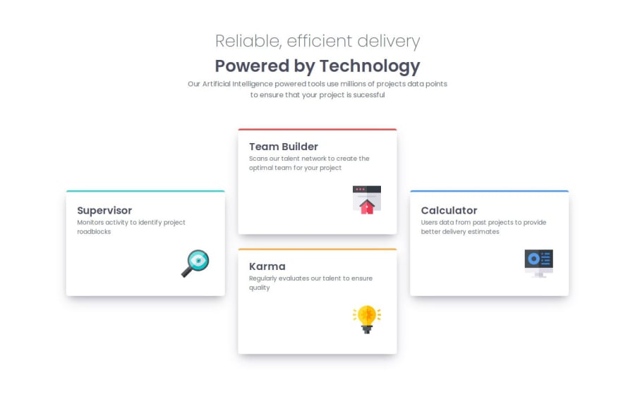
  <body>
    <header class="intro-card">
      <p class="intro-pg">Reliable, efficient delivery</p>
      <h1 class="title">Powered by Technology</h1>
      <p class="description-pg">
        Our Artificial Intelligence powered tools use millions of projects data
        points to ensure that your project is successful
      </p>
    </header>
    <main>
      <article class="supervisor">
        <h2>Supervisor</h2>
        <p>Monitors activity to identify project roadblocks</p>
        <img src="./Imgs/icon-supervisor.svg" alt="Supervisor icon" />
      </article>

      <section class="double-card-section">
        <article class="team-builder">
          <h2>Team Builder</h2>
          <p>Scans our talent network to create the optimal team for your project</p>
          <img src="./Imgs/icon-team-builder.svg" alt="Team Builder icon" />
        </article>

        <article class="karma">
          <h2>Karma</h2>
          <p>Regularly evaluates our talent to ensure quality</p>
          <img src="./Imgs/icon-karma.svg" alt="Karma icon" />
        </article>
      </section>

      <article class="calculator">
        <h2>Calculator</h2>
        <p>Uses data from past projects to provide better delivery estimates</p>
        <img src="./Imgs/icon-calculator.svg" alt="Calculator icon" />
      </article>
    </main>
  </body>
Marked as helpful0

Please log in to post a comment
Log in with GitHub
Join our Discord community
Join thousands of Frontend Mentor community members taking the challenges, sharing resources, helping each other, and chatting about all things front-end!
Join our Discord