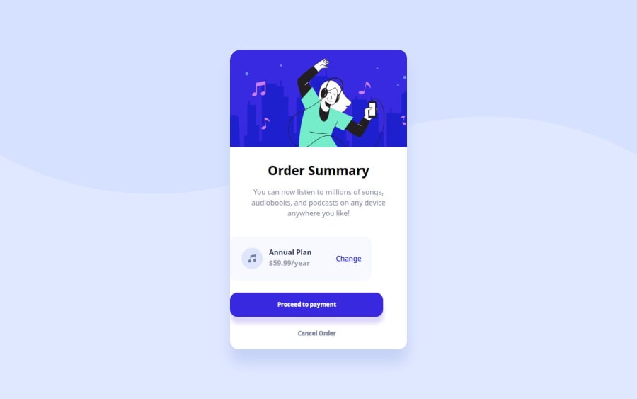
A responsive Order summary component card built with HTML and CSS
Design comparison
Solution retrospective
I've just completed another challenge
What challenges did you encounter, and how did you overcome them?I had problem creating the payment container
What specific areas of your project would you like help with?I opened the live url website on chrome and safari, then I discovered that some elements of the design on safari were not styled properly but it was fine on chrome. I need help with this.
Community feedback
- @BrianMunizSilveiraPosted 5 months ago
Solution Retrospective: Order Summary Component Challenge
What Are You Most Proud Of, and What Would You Do Differently Next Time?
Great job completing another challenge! Your implementation demonstrates good use of CSS Flexbox and media queries to create a responsive design. It’s also commendable that you’ve styled the component effectively to align with the provided design.
Next time, you might want to focus on cross-browser compatibility earlier in the development process to identify and address inconsistencies between browsers like Chrome and Safari.
What Challenges Did You Encounter, and How Did You Overcome Them?
You mentioned facing an issue with the payment container. Your current approach shows progress in styling it effectively, but it could benefit from some fine-tuning, especially with spacing and alignment. It’s great that you managed to style the element as intended after some adjustments.
Additionally, the styling differences between Chrome and Safari are a common challenge. Addressing these requires understanding how different browsers interpret CSS properties and testing on multiple platforms during development.
Suggestions for Improvement
Here are some recommendations to enhance your project:
1. Fixing Cross-Browser Styling Issues
Safari and Chrome sometimes interpret CSS differently, especially with flexbox and spacing. Here are a few strategies:
- Check
flexProperty Behavior: Safari might require explicit settings foralign-itemsandjustify-contentto render elements properly. - Vendor Prefixes: Use a CSS autoprefixer tool to ensure compatibility with older browser versions. For example:
display: -webkit-flex; /* Safari fallback */ display: flex; - Test Specific Properties: Padding, margin, and overflow properties may behave differently. Test by setting consistent box models using
box-sizingand inspecting layout differences in developer tools.
2. Refine the Payment Container
Your current payment container layout works, but you can enhance alignment and responsiveness:
- Align Text and Icon Properly: Ensure the text and icon stay aligned vertically and adjust spacing for cleaner visuals. Example update:
   .payment-container {
    display: flex;
    align-items: center; /* Aligns items vertically */
    justify-content: space-between; /* Creates proper spacing */
    padding: 1rem; /* Adds internal spacing */
}

.music-icon {
    width: 3em;
    height: 3em;
    margin: 0; /* Reset unnecessary margins */
}

.payment-container p {
    margin: 0; /* Removes excess margins */
}

a {
    text-decoration: underline; /* Ensures consistent link style */
    font-weight: bold;
}
3. Enhance Mobile Responsiveness
Your mobile styles are well-implemented, but consider tweaking button sizes and spacing for smaller screens:
@media screen and (max-width: 450px) {
    .btn {
        padding: 1em 4em; /* Adjust padding for smaller screens */
    }

    .payment-container {
        width: 100%; /* Make the container full-width */
    }

    section > p {
        font-size: 0.875rem; /* Improve text readability on smaller screens */
    }
}
4. Add Hover and Focus Effects
Enhancing interactivity with hover and focus effects can improve the user experience:
.btn:hover {
    filter: brightness(90%);
}

a:hover {
    color: hsl(245, 75%, 52%);
    text-decoration: none;
}
5. Comment Your CSS for Clarity
Adding comments to your CSS improves readability and helps with collaboration. For example:
/* Main container for the card */
.parent-container {
    background: url(pattern-background-desktop.svg);
    background-color: hsl(225, 100%, 94%);
    min-height: 100vh;
    display: flex;
    justify-content: center;
    align-items: center;
    background-repeat: no-repeat;
    background-size: contain;
}
Summary
Your implementation is strong, with a responsive layout and well-structured HTML and CSS. By addressing cross-browser issues, refining responsiveness, and adding interactive details, you can elevate your project even further.
Keep testing and improving! The more challenges you take on, the stronger your skills will become. 🚀😊
Brian.
Marked as helpful1@TaophyccPosted 5 months ago@BrianMunizSilveira Thanks Brian, this was really insightful 🙏🏾
1 - Check
Please log in to post a comment
Log in with GitHubJoin our Discord community
Join thousands of Frontend Mentor community members taking the challenges, sharing resources, helping each other, and chatting about all things front-end!
Join our Discord
