Submitted over 1 year ago
A Responsive Glance at Countries
#react#bootstrap
@Tascate
Design comparison
SolutionDesign
Solution retrospective
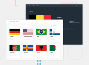
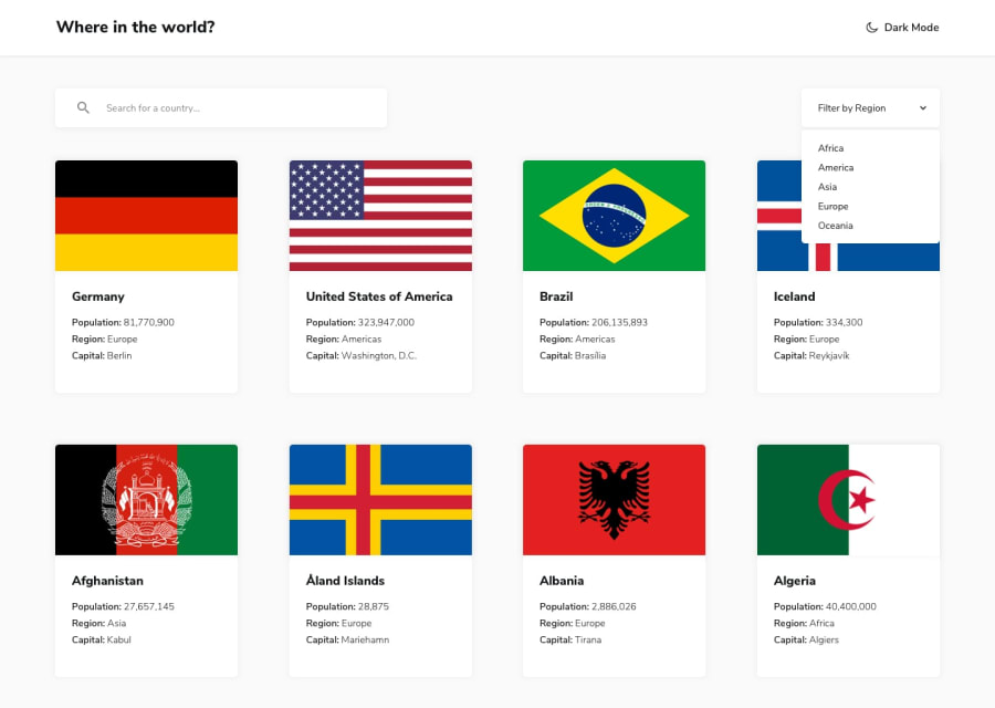
For my solution, I wanted to minimize the usage of media queries and rely on scaling by the browser instead. I thought this would be perfect for this as the design did not change much from mobile to desktop. I wonder if this is acceptable haha. Also, the flags provided by the API were all different size ratios. This made each country not uniform and a pain to CSS :/ I compromised by having flags take up enough height/width to keep from distorting and made neighboring countries the same height.
Community feedback
Please log in to post a comment
Log in with GitHubJoin our Discord community
Join thousands of Frontend Mentor community members taking the challenges, sharing resources, helping each other, and chatting about all things front-end!
Join our Discord
