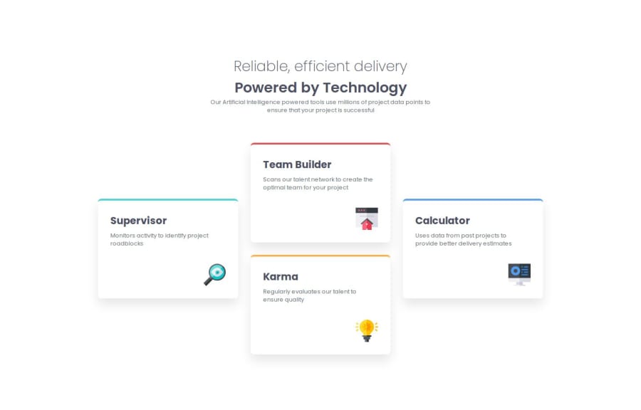
A responsive four-card feature section on a landing page


Design comparison

Solution retrospective
I'd like to use CSS Grid more often in the future for projects that require dynamic and fairly complex layouts.
What challenges did you encounter, and how did you overcome them?At first I was quite confused about how to make the elements on the right and left aligned vertically in the CSS class bottom-section section. But by using the CSS property display: grid; it can all be solved quite easily.
Is the method/approach I used to achieve the design correct? If there is anything that needs to be improved, where is it?
For those of you who have taken the time to give me feedback, I say thank you very much and appreciate it. 😊
Please log in to post a comment
Log in with GitHubCommunity feedback
No feedback yet. Be the first to give feedback on Lutfi Ismail's solution.
Join our Discord community
Join thousands of Frontend Mentor community members taking the challenges, sharing resources, helping each other, and chatting about all things front-end!
Join our Discord