Submitted 11 months ago
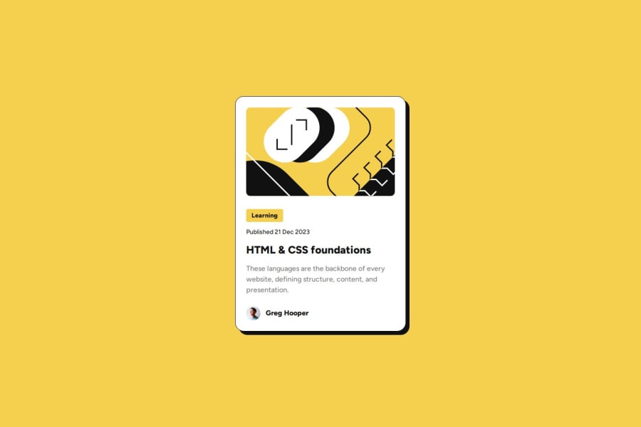
A responsive blog preview card made with HTML & CSS
P
@Choconaldo
Design comparison
SolutionDesign
Solution retrospective
What are you most proud of, and what would you do differently next time?
I improved my Figma reading a lot with this challenge.
What challenges did you encounter, and how did you overcome them?Finding the correct typography to make the responsiveness exactly as the Figma requires.
What specific areas of your project would you like help with?I did just fine, in my opinion.
Community feedback
Please log in to post a comment
Log in with GitHubJoin our Discord community
Join thousands of Frontend Mentor community members taking the challenges, sharing resources, helping each other, and chatting about all things front-end!
Join our Discord
