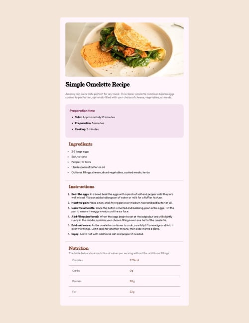
A responsive based page that concluded with the media query the manage

Solution retrospective
I've just completed a front-end coding challenge from @frontendmentor! 🎉
You can see my solution here: https://recipe-page-frontend-mentorchallenge.netlify.app/
Any suggestions on how I can improve are welcome!
What challenges did you encounter, and how did you overcome them?More concentration in the responsive and visibility.
This will enhance the responsiveness of the page with percentage based width and height with media query to manage the container in mobile preview.
What specific areas of your project would you like help with?The page will enhanced in responsive that will enable the width with respect to the display resolution with media query that deals with the container to enumerates the function of the container and inner classes
Please log in to post a comment
Log in with GitHubCommunity feedback
No feedback yet. Be the first to give feedback on DHANUSH K's solution.
Join our Discord community
Join thousands of Frontend Mentor community members taking the challenges, sharing resources, helping each other, and chatting about all things front-end!
Join our Discord