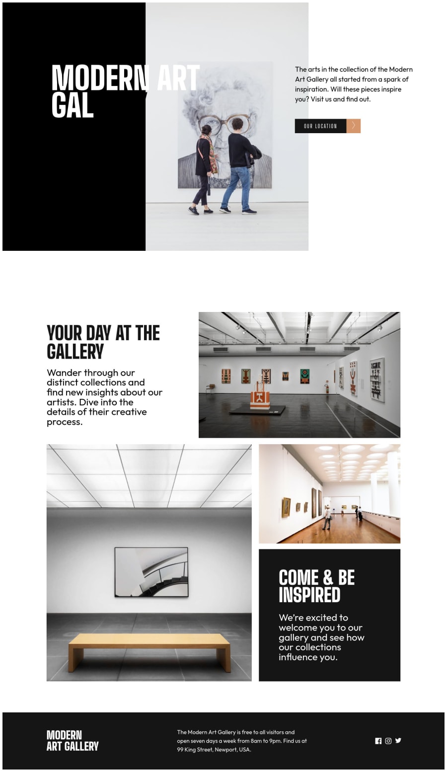
a responsive art gallery website using grid, flexbox and leaflet map
Design comparison
Solution retrospective
Can't seem to get how to partially style the header in line with the design. I could only do it for screenshot purpose(I used the letter "I" to achieve this) because it is not responsive. Anybody with an idea on how to do it should comment.
Community feedback
- @vanzasetiaPosted almost 3 years ago
Hi, Faruk! 👋
I recommend reading this CSS Tricks article to make the text color adjust based on the background color. After, you know how it works, I recommend removing the "hack" and then using the better approach to achieve it.
I suggest using CSS to uppercase the text. The uppercased word in the HTML might be spelled by the screen reader (spelled letter by letter).
On 870px width, there is an issue where the
image-herois touching with the next section. So, I recommend fixing it. Also, on 376px for both pages, there is not enough room yet to make the layout into two-column.Hope this helps.
Marked as helpful0@farukingPosted almost 3 years ago@vanzasetia thank you for your inputs, I already made the design public and would take care of the rest.
0@vanzasetiaPosted almost 3 years ago@faruking Great! Now, I can see the source code. 😉
0 - @tiffanicodesPosted almost 3 years ago
Hey! Your website looks great! Would you mind updating your view code link? When I clicked on it it didn't work. Would love to see how you created such a beautiful website!
0@farukingPosted almost 3 years ago@tiffanicodes Thanks for the compliment, The link works well on this end. Here is the link for clarification github link
0@vanzasetiaPosted almost 3 years ago@faruking I can't see the code as well. It looks like the repository is private (I guess). So, make sure that it is a public repository.
0
Please log in to post a comment
Log in with GitHubJoin our Discord community
Join thousands of Frontend Mentor community members taking the challenges, sharing resources, helping each other, and chatting about all things front-end!
Join our Discord
