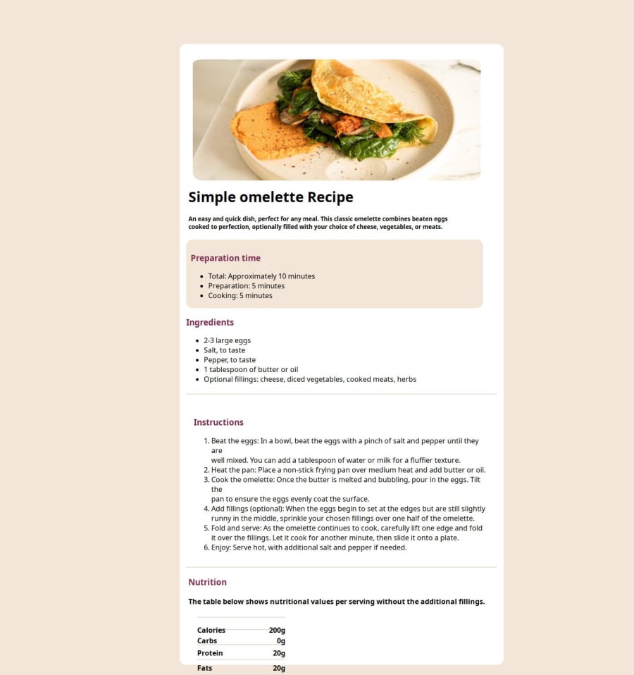
Design comparison
Solution retrospective
I am able to create containers that were progressive.i was able to pre meditate my work and work more.
What challenges did you encounter, and how did you overcome them?styling was my so experincing i need to learn more.I used the Internet to be able cop up with the situation.
What specific areas of your project would you like help with?CSS is a major problem for me i want to be able to design more this will help me so much.CSS is so major and the properties and components of css.
Please log in to post a comment
Log in with GitHubCommunity feedback
- Account deleted
👏👏
The table's content is overflowing because you set a fixed height to the container, and that's not necessary because it won't let the container to grow bigger if it's necessary (and we can see that it is necessary in this case). You could use min-height instead, or something like height: 100% or simply delete that line, so the container's height would be the content's height and that'd work just fine.
You could also have used semantic tags like <main>, <header>, <article>, etc. for the HTML instead of generic divs, this would help non-sighted users and search engine optimization. Using an actually HTML table to build the nutrition table would be nice as well XD.
- HTML table basics by MDN - "This article gets you started with HTML tables, covering the very basics such as rows, cells, headings, making cells span multiple columns and rows, and how to group together all the cells in a column for styling purposes."
- HTML table advanced features and accessibility by MDN - "In the second article in this module, we look at some more advanced features of HTML tables — such as captions/summaries and grouping your rows into table head, body and footer sections — as well as looking at the accessibility of tables for visually impaired users."
- Styling HTML tables by MDN - "Styling an HTML table isn't the most glamorous job in the world, but sometimes we all have to do it. This article provides a guide to making HTML tables look good, with some specific table styling techniques highlighted."
Marked as helpful - @nivrii
Niaje Ogolla. Ni polepole tu. Keep up with the consistency ata mimi css ilikua inanikula kichwa pia
Marked as helpful
Join our Discord community
Join thousands of Frontend Mentor community members taking the challenges, sharing resources, helping each other, and chatting about all things front-end!
Join our Discord
