Not Found
Not Found
Not Found
Not Found
Not Found
Not Found
Not Found
Not Found
Not Found
Not Found
Not Found
Not Found
Not Found
Not Found
Not Found
Not Found
Not Found
Not Found
Not Found
Not Found

Submitted

A QRcode box design created using flexbox

Marvy 20

@GITmarvel

Desktop design screenshot for the QR code component coding challenge

This is a solution for...

  • HTML
  • CSS
1newbie
View challenge

Design comparison


SolutionDesign

Solution retrospective


What are you most proud of, and what would you do differently next time?

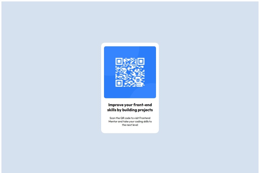
I'm proud that i was able to utilize my flexbox skills to create the box design . What i'd do next time is to adequately scrutinize the design template before starting to code to save some time.

What challenges did you encounter, and how did you overcome them?

The challenge i would say i encountered was making the content within the box identical to the template.

What specific areas of your project would you like help with?

none

Community feedback

P
Steven Stroud 4,100

@Stroudy

Posted

Hey, Great job with this solution you should be proud, A few things I noticed,

  • Missing a <meta> description tag for SEO purposes,
  • Setting a height and width attribute to your <img> will increase performance to reduce layout shifts and improve CLS, It reserves the space on the page for the image,
  • It is best practice to have a <main> tag inside your body highlighting the main section.
  • ‍Using max-width: 100% or min-width: 100% is way more responsive then just width:100%, check out this article also from the same Frontend mentor dev responsive-meaning, she goes into more detail.
  • You should avoid using px as it is an absolute unit and not a responsive unit like rem or em, You should look at this article from a Frontend mentor dev, Why font-size must NEVER be in pixels.
  • Another great resource for px to rem converter.
  • Missing a alt="" on your <img>, Having better alt="" descriptions for accessibility is a must check this out Write helpful Alt Text to describe images,
  • You should apply a full modern reset to make things easier as you build, check out this site for a Full modern reset
  • Using a naming convention like BEM, Using proper naming will prepare you for the changes in design of the website.
  • It is best practice to use margin-inline: auto; to center left and right then than just margin: auto;, You can center the height by using this code snippet
  min-height: 100svh;
  display: flex;
  justify-content: center;
  flex-direction: column;

I hope you found some of this information helpful, You should give the articles a good read and I look forward to seeing some more from you, Happy coding! 💻

Marked as helpful

2

Marvy 20

@GITmarvel

Posted

Thank you@Stroudy . I really appreciate it

1
P
Nico 330

@Nico243

Posted

I have a few suggestions that can help you.

  1. Inspection tool - When in a browser you can press q or Ctrl + Shift + C to open it up. When you go through this you'll see properties and values that you added in your code.

For example "margin: : 0;" is a typo which is common in the beginning and your inspection tool would cross it out. It is worth checking it out.

  1. VSC IDE. If you open your code in VSC you'll see at the bottom a circle with a cross in it and if you hover over it, it would display any errors. This is a quick way to quickly fix our mistakes.

if we look further into this specific line of code:

    * {
        margin: : 0; 
        padding: 0;
        box-sizing: border-box;
    }

margin: : 0; /corrected/ margin: 0; (this one typo is effecting the rest of the nesting, when you fix it the you'll have sorted out all mistakes)

overall it looks great, Well done!

Happy coding!

Marked as helpful

2

Marvy 20

@GITmarvel

Posted

Thank you @Nico243 . I've made some adjustments

1
P

@Islandstone89

Posted

HTML:

  • Every webpage needs a <main> that wraps all of the content, except for <header> and footer>. This is vital for accessibility, as it helps screen readers identify a page's "main" section. Replace <section> with a <main>.

  • Remove the .entire div, it is not needed.

  • The image has meaning, so it must have proper alt text. Write something short and descriptive, without including words like "image" or "photo". Screen readers start announcing images with "image", so an alt text of "image of qr code" would be read like this: "image, image of qr code". The alt text must also say where it leads(the frontendmentor website). A good alt text would be "QR code leading to the Frontend Mentor website."

  • Headings should always be in order, so you never start with a <h3>. I would change it to a <h2> - a page should only have one <h1>, reserved for the main heading. As this is a card heading, it would likely not be the main heading on a page with several components.

  • .attribution should be a <footer>, and you should use <p> for the text inside.

CSS:

  • It is best practice to write CSS in a separate file, often called style.css. Create one in the same folder as the index.html, and link to it in the <head>: <link rel="stylesheet" href="style.css">.

  • Including a CSS Reset at the top is good practice.

  • I would recommend adding 1rem of padding on the body, to ensure the card doesn't touch the edges on small screens.

  • Remove ALL positioning properties.

  • Move the properties on section to body, and add flex-direction: column and gap: 2rem.

  • Instead of using complex selectors like section .box .imgbx img, give elements a class and use that as the selector.

  • Remove all widths and heights.

  • Add a max-width of around 20rem on the card, to prevent it from getting too wide on larger screens.

  • font-size must never be in px. This is a big accessibility issue, as it prevents the font size from scaling with the user's default setting in the browser. Use rem instead.

  • Paragraphs have a default value of font-weight: 400, so there is no need to declare it.

  • Since all of the text should be centered, you only need to set text-align: center on the body, and remove it elsewhere. The children will inherit the value.

  • On the image, add display: block and max-width: 100% - the max-width prevents it from overflowing its container. Without this, an image would overflow if its intrinsic size is wider than the container. max-width: 100% makes the image shrink to fit inside its container.

  • To create the space between the image and the edge of the card, set padding on all 4 sides of the card:padding: 16px;.

2

Marvy 20

@GITmarvel

Posted

Thanks@Islandstone89 👍

1

Please log in to post a comment

Log in with GitHub
Discord logo

Join our Discord community

Join thousands of Frontend Mentor community members taking the challenges, sharing resources, helping each other, and chatting about all things front-end!

Join our Discord