Submitted 11 months ago
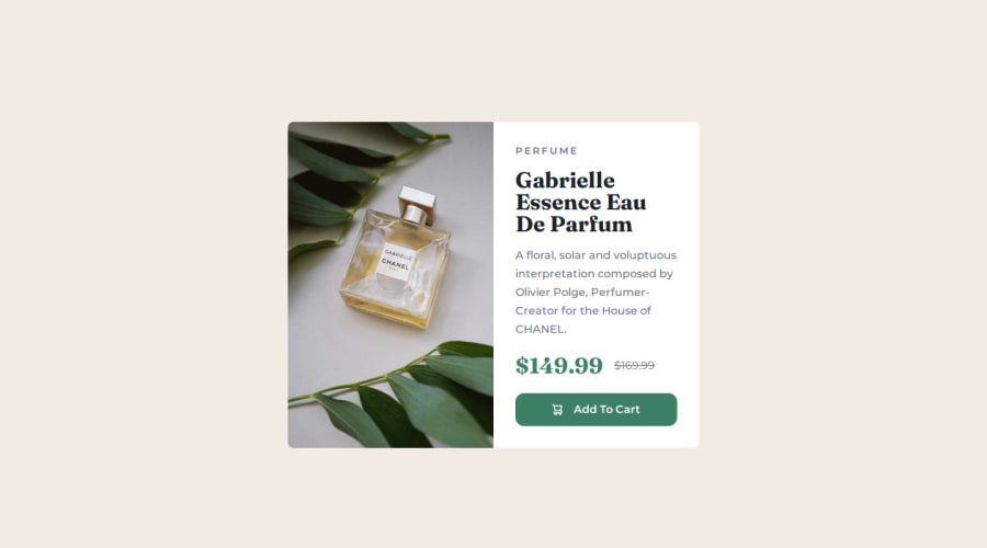
A Product Preview Component made with HTML and CSS
#accessibility
@sanyomor-01
Design comparison
SolutionDesign
Solution retrospective
What are you most proud of, and what would you do differently next time?
I applied the mobile-first design approach in this challenge . It came out nice. I learned a lot on responsive layouts.
What challenges did you encounter, and how did you overcome them?Styling for the desktop view quite a challenge. Media I used media queries in combination with the appropriate lengths to solve this problem.
What specific areas of your project would you like help with?I realize I wrote a lot of code in the css file. Any suggestion to improve it is much welcomed. Thank You.
Community feedback
Please log in to post a comment
Log in with GitHubJoin our Discord community
Join thousands of Frontend Mentor community members taking the challenges, sharing resources, helping each other, and chatting about all things front-end!
Join our Discord
