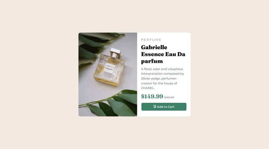
A product preview card using html and css , flexbox too


Design comparison

Solution retrospective
i made use of the the source tag and that helped the images switch when the screen increase for the desktop and mobile screen image, so happy i learnt this
What challenges did you encounter, and how did you overcome them?switching the two images in the file cause there are two images for desktop and mobile, but then i searched and read about source tag and it help me switch between the different images in different screen sizes and also have a fallback image incase non of the screen sizes are met , it was a great learning experience
What specific areas of your project would you like help with?probably grid (aligning stuff properly)
Community feedback
- @uzainmalik123Posted 3 months ago
use grid on some complex stuff you have used flex that is fine i would say that use gap with flex that would be perfect for aligning stuff.
and btw my name is short for also uzi i use it in games.
Marked as helpful0

Please log in to post a comment
Log in with GitHub
Join our Discord community
Join thousands of Frontend Mentor community members taking the challenges, sharing resources, helping each other, and chatting about all things front-end!
Join our Discord