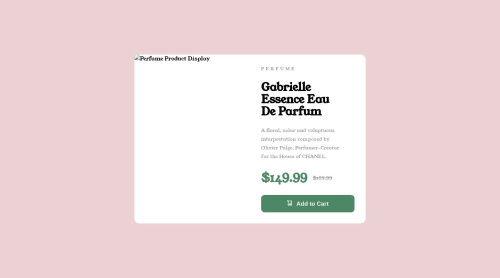
Submitted about 2 years agoA solution to the Product preview card component challenge
A product Page using HTML & CSS only

@Marvyeddy
Solution retrospective
Give your review on this... i feel i am actually getting better
Code
Loading...
Please log in to post a comment
Log in with GitHubCommunity feedback
No feedback yet. Be the first to give feedback on Marvelous Edwards's solution.
Join our Discord community
Join thousands of Frontend Mentor community members taking the challenges, sharing resources, helping each other, and chatting about all things front-end!
Join our Discord