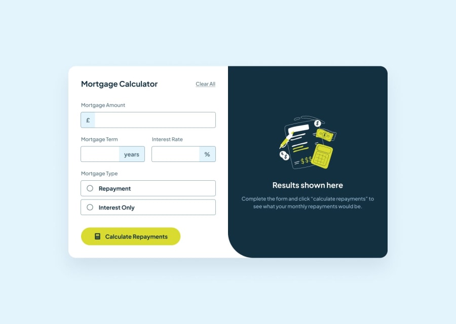
Design comparison
SolutionDesign
Solution retrospective
What are you most proud of, and what would you do differently next time?
I added a screenshot as an image to the content for the project to look more close with the design. The image colour was different from the background colour I earlier applied to the parent element. I was able to mix the colour with rgb() to eliminate the obvious difference and I got the desired colour. This makes me proud
What challenges did you encounter, and how did you overcome them?I couldn't style with CSS when it is checked. I had to leave it like that
What specific areas of your project would you like help with?I am a novice in JavaScript. I would like my code to be reviewed more in this area
Another thing is inability to style with CSS when it is checked
Community feedback
Please log in to post a comment
Log in with GitHubJoin our Discord community
Join thousands of Frontend Mentor community members taking the challenges, sharing resources, helping each other, and chatting about all things front-end!
Join our Discord
