Design comparison
Solution retrospective
Hi everyone,
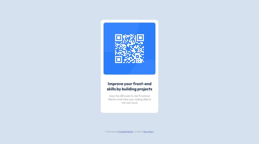
I just completed my first challenge on Frontend Mentor, focusing on the QR code component. As a newbie to the challenge, it was an exciting learning experience.
Before I move forward, I'd love to hear your thoughts and suggestions on my first approach to mobile-first design. Any insights or best practices you can share would be incredibly valuable for my growth. Feel free to check out my work, and I'm open to learning from the community.
Thank you all in advance for taking the time to review my work and share your knowledge!
Best regards,
Rora
Community feedback
- @ChamuMutezvaPosted 9 months ago
Greetings Rora
Congratulations for completing your first challenge. Well done, here are a few points to consider.
- some of the elements to consider when creating a website are landmark elements. They provide a powerful way to structure your website and these include the
main, header and footer
. In this challenge I think we should be having the main element. For information read the following article on landmark elements - all images should have an
alt
attribute, where decorative images can have an empty value, the image in this challenge seems to be sending a message to users - hence it should be descriptive - the component is not centered like on the design - that can be achieved with using
flex
as you have done on the body and additional addingmin-height: 100vh
instead of theheight
property. - this challenge can be done without a media query, the
.card
component should use amax-width
property instead of thewidth
property. Let your sizes be in rems as well as the font-sizes
Marked as helpful0@Rgit915Posted 9 months agoHello @ChamuMutezva,
Thank you for your thoughtful feedback. I appreciate the time you took to provide such valuable insights. Thanks for your guidance; I'll implement these changes to improve my solution and keep these principles in mind for future projects.
0 - some of the elements to consider when creating a website are landmark elements. They provide a powerful way to structure your website and these include the
Please log in to post a comment
Log in with GitHubJoin our Discord community
Join thousands of Frontend Mentor community members taking the challenges, sharing resources, helping each other, and chatting about all things front-end!
Join our Discord