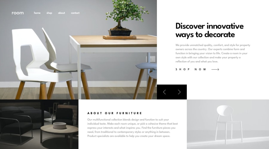
A mobile responsive page built with react, tailwind CSS
Design comparison
Solution retrospective
it was kind of hard to get a carousel with pictures and content but I finally got it done.
the carousel button on mobile screen kind of changes position based on different viewports. is it because i use absolute?
Community feedback
- @ZukizukPosted 10 months ago
Hello there, Congratulations on completing this project
Your solution looks nice
I have few suggestions that I think might be of interest to you.
- HTML: Consider using semantic HTML tags like
<main></main>,<section></section>and others that you can find in this link. And in this case, replace the<div>with<main>. the main tag should hold the main content of the page so consider correcting that.The semantic HTML tags help the search engines and other user devices to determine the importance and context of web pages. The pages made with semantic elements are much easier to read. It has greater accessibility. It offers a better user experience. Using div when there's a better alternative is not a good practice as div hold no semantic value.
And to answer your question, I think it was because you didn't position it relative to it parent container but just positioned it absolutely, so give the button's ancestor element a
position: relative;I would also suggest you use swiperJS for the carousel. link provided here swiperjsI hope this feedback is helpful
Other than that great job
0@MikkybeardlessPosted 10 months ago@Zukizuk Thank you so much, you comments were helpful especially the swiperjs framework advice. The parent of the carousel button is already set to position relative but thanks once again. I will make the necessary adjustments
0
Please log in to post a comment
Log in with GitHubJoin our Discord community
Join thousands of Frontend Mentor community members taking the challenges, sharing resources, helping each other, and chatting about all things front-end!
Join our Discord
