Submitted 3 months ago
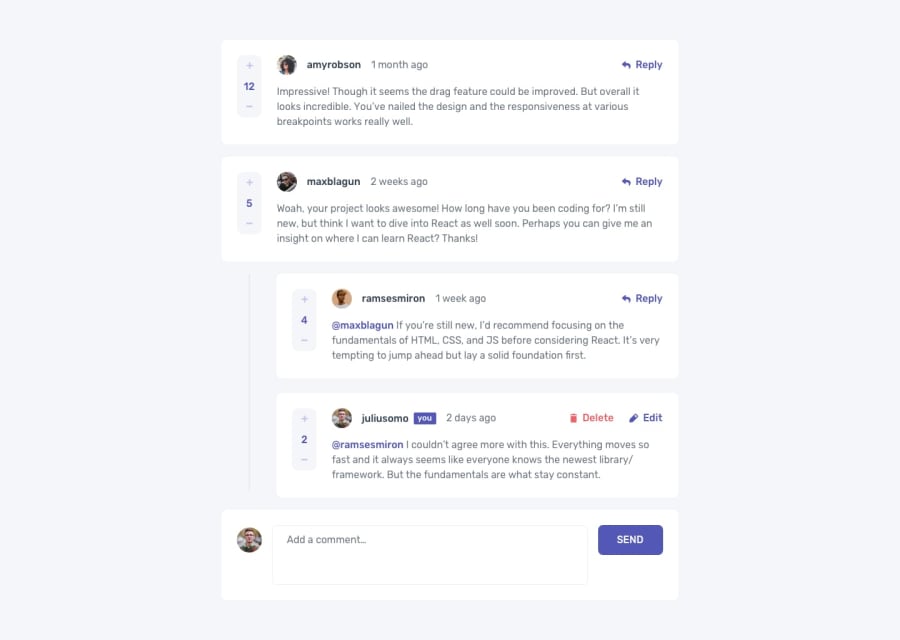
A mobile first interactive comment section component
@DR-KSP-VIRUS
Design comparison
SolutionDesign
Solution retrospective
What are you most proud of, and what would you do differently next time?
I am proud of the layout of the components in the section. Thinking to use tailwindcss to build out the same component
What challenges did you encounter, and how did you overcome them?Laying out the component for mobile and desktop was a bit difficult. but I was able to use grid and flex system to accomplish that easily
What specific areas of your project would you like help with?Learning the concept of using modals in components
Community feedback
Please log in to post a comment
Log in with GitHubJoin our Discord community
Join thousands of Frontend Mentor community members taking the challenges, sharing resources, helping each other, and chatting about all things front-end!
Join our Discord
