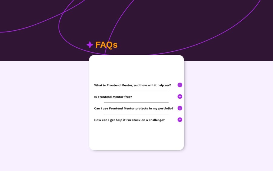

Design comparison

Solution retrospective
first: i dont know why but when images folder is inside a folder the github pages did't read it that alone make me spine around second: i need advice about the mobile media i don't know why it does not work last: i want to make when i show one questions and click on other the first disappear and the second come out
Community feedback
- @jen67Posted 11 months ago
Great job on your code! 🚀 If you're interested in diving deeper into accordions, check out these quick resources:
Happy coding, and keep up the good work! 👏
Marked as helpful1@ousey-ouseyPosted 11 months agoso why @media does not work in the img url i designed it from screen device first@jen67
0@jen67Posted 11 months ago@ousey-ousey
I tried tweaking your codes and changing some things and it looked a little bit better with these changes. You can go through them and check if it helps your design look better. Also for media queries, You can check out this links to learn more about responsive design.
These are some code snippets I tried
Desktop View Adjustments
/* Added padding for breathing space in .c-1 */
.c-1 {
    padding: 2rem;
}

/* Removed left padding from paragraphs */
#p-1, #p-2, #p-3, #p-4 {
    padding: 20px 0 20px 0;
}

/* Adjusted font size for paragraphs */
#pt-1, #pt-2, #pt-3, #pt-4 {
    font-size: 16px;
}

/* Adjusted width for hr */
hr {
    width: 100%;
}
Mobile View Adjustments
/* Adjusted background image styling in .b-img img */
.b-img img {
    background-size: cover;
    width: 100%;
    height: 30vh;
    object-fit: none;
}

/* Reduced width of .c-1 and added automatic margins for centering */
.c-1 {
    width: 90%;
    margin: 0 auto;
}

/* Adjusted padding for .c-1 in mobile view */
.c-1 {
    padding: 1rem;
}

/* Adjusted font size and positioning for #head */
#head {
    font-size: 2rem;
    left: 0;
}

/* Adjusted styling for list items in .c-1 ul li */
.c-1 ul li {
    padding: 1rem 0;
    font-size: 1rem;
    margin-right: 0;
    display: block;
}

/* Adjusted positioning for li::before in mobile view */
.c-1 ul li::before {
    right: 0;
}

/* Adjusted font size for paragraphs in mobile view */
#pt-1, #pt-2, #pt-3, #pt-4 {
    font-size: 1rem;
}
Hope these edits simplify things a bit! Great job! 👏
1 - @danielmrz-devPosted 11 months ago
Hello @ousey-ousey!
Your solution looks pretty good!
I'm gonna give you just two very simple suggestions:
-
First: You don't need a separate div to create that background pattern. You can use both
background-imageandbackground-coloron the body. They will not cancel each other. -
Second: The title and the image are supposed to be inside the card.
I know there are a lot of things you have to address, but start with the little ones 😊
I hope it helps!
Marked as helpful0@ousey-ouseyPosted 11 months agoI put it out as when i click the p appear it go over the title @danielmrz-dev
1 -


Please log in to post a comment
Log in with GitHub
Join our Discord community
Join thousands of Frontend Mentor community members taking the challenges, sharing resources, helping each other, and chatting about all things front-end!
Join our Discord