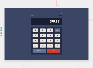
Design comparison
SolutionDesign
Community feedback
- @LadipopPosted 4 months ago
I really don't know why it looks this way on here. Idk what screen width y'all use
0@samuel-aduPosted 4 months ago@Ladipop good work with the logic, but you need to start paying more attention to the presentation. Wrap the whole app in main element, and give it the specified width. After that you can use the body and as a flex parent and use it to center the app. Remember to give the body a height of 100svh for it to work.
Also I didn't give an code snippets because i can tell you are not a beginner.
You can respond to this message if you need further assistance
Marked as helpful1
Please log in to post a comment
Log in with GitHubJoin our Discord community
Join thousands of Frontend Mentor community members taking the challenges, sharing resources, helping each other, and chatting about all things front-end!
Join our Discord
