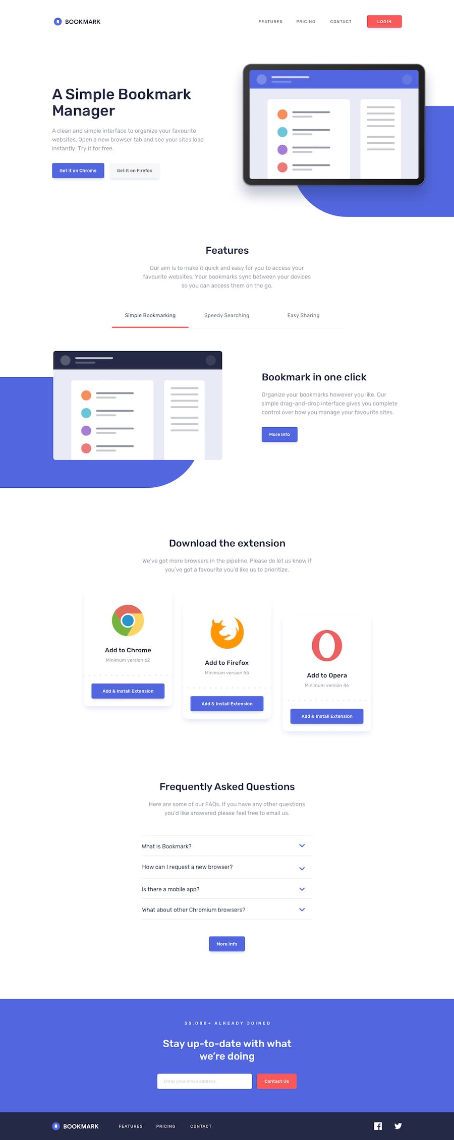
A fullyy responsive bookmark-landing-page
Design comparison
Solution retrospective
any suggestion and contribution are welcomed
Community feedback
- @willcook4Posted about 5 years ago
A really good first try.
-
Consider fixing the issues raised in your report above. Things like aria labels are important but easy to forget.
-
Clean up your stylesheet. A standard format of
selector {
    property1: arg;
    property2: arg;
}
this will make it easier to read/work with. Keep consistent.
-
Clean up your html file. You have things commented out. If it isn't a comment then consider cleaning it away.
-
Your JS file has a surplus console.log in it. Decide if you need this in production. Also consider removing the extra lines in the js file. One between your event listener and your function will do.
-
Update your readme. You will forget what this challenge is about later. Make it easy for you and for others to see what you were doing and why.
1@swaraj4410Posted about 5 years ago@willcook4 hey thanks for the review. I really appreciate it. I will now apply the changes.
If you are ok then I would like to make a project with you.0 -
Please log in to post a comment
Log in with GitHubJoin our Discord community
Join thousands of Frontend Mentor community members taking the challenges, sharing resources, helping each other, and chatting about all things front-end!
Join our Discord
