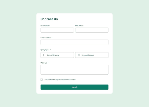
Design comparison
Solution retrospective
I am proud of this project in general because this is the first time I make a multiple inputs validation, this IS the hardest one so far, it took more than any other project. next time I should work more on managing how to make the project then make rather than getting stuck not knowing what to do. π
What challenges did you encounter, and how did you overcome them?I had to do some research on how to do this validation, with some searching on youtube, I got a general idea on the way of thinking to make it, and I did. I tryied not to copy but rather do it my way because knowing how to do it is the key not the exact code of the project.
What specific areas of your project would you like help with?I have a small issues with the error message sticking up and pushing the input up with it, so If you YOU know how to fix it, please tell me I would be delighted to know how... and for the success message at the end I cant think of a way to make it show up after validating everything so that too... π’π
Community feedback
- @RoksolanaVeresPosted 5 months ago
Hi, I played a bit with your solution and came up with an idea of how to make it work. The problem is that you are using .checkValidity() method to find out whether the form is valid but it doesn't work as you expect, because this method validates the form based on the attributes you use in inputs, like
required
ormin / max
. But since you don't use any of them (and for this particular project you don't need to use them), checkValidity() doesn't actually validate anything. So, you need to create your own validation logic for this.So, here is how I solved it: first, I deleted your validation if statement (this one):
if (form.checkValidity()) { showSuccess() }
and wrote the checkFormValidity function which loops through your error messages and sets formIsValid to true if all the error messages have "hide" class (thus they're all valid), and false if even one of the messages doesn't have the "hide" class. It also resets the form in case it is valid (according to the challenge requirements)
const errorMessages = document.querySelectorAll(".error-message"); let formIsValid = false; // these should go to the global scope at the top of the page function checkFormValidity() { for (let message of errorMessages) { if (!message.className.includes("hide")) { formIsValid = false; break; } formIsValid = true; } if (formIsValid) { form.reset(); } }
also I deleted your showSuccess function and instead made showSuccessIfFormIsValid which shows the message if the form is valid and hides it otherwise:
const success = document.querySelector(".success"); // this should go to the global scope at the top of the page function showSuccessIfFormIsValid() { if (formIsValid) { success.style.display = "flex"; } else { success.style.display = "none"; } }
Now you include checkFormValidity() and showSuccessIfFormIsValid() to form submission event and it should work:
form.addEventListener("submit", (e) => { e.preventDefault(); validateInputs(); checkFormValidity(); showSuccessIfFormIsValid(); });
As to the problem with inputs being pushed up by the error messages: you can just use position absolute for the messages, thus they won't influence the layout.
I tried to be as detailed as possible, but if my explanation is not good enough, you can always ask additional questions. Good luck!
Marked as helpful0@Caelus111Posted 5 months ago@RoksolanaVeres
I took so much time with this project that I surrendered when the success message didnt work as intended... This answers all my problems, thank you so much, you a life saver!!
I wanna ask a question, how did you think of the solution of my problem, I am not gonna lie, I thought about using the hide class as a way to verify that all the inputs are good but didnt give it that much thinking.
anyway thank you for the thorough answer, I appreciate your hard work. π
1@RoksolanaVeresPosted 5 months ago@Caelus111 Oh, I'm happy that it helped :) Looks stunning!
Honestly, I don't think that checking the validity of a form through classes in error messages is the best possible option, but in your particular case, it was the first idea that came to my mind and doesn't require much code rewriting.
If I started from the very beginning, I would probably choose another approach. I would write some statements to check the validity of each particular field, for example, something like this:
let firstNameIsValid = firstNameInput.value.trim() !== ""; let lastNameIsValid = lastNameInput.value.trim() !== ""; ... etc
and then when you press the submit button, you verify the validity of the form by checking if all your statements are truthy (in other words if all the inputs are valid)
let formIsValid = firstNameIsValid && lastNameIsValid && emailIsValid ...
something like that
But I'm also still learning, so definitely don't take my words as a single source of truthπ
One more thing: I've noticed that you overuse fieldset tag. According to mdn, <fieldset> is used to group several controls as well as labels (<label>) within a web form, thus it's great to use it in the Query Type block to group these radio buttons together, but there is no need to wrap every single label and input into a fieldset
1@Caelus111Posted 5 months ago@RoksolanaVeres Oh it did really help, thanks for all the information about the other way of verification and the fieldset one.
I will try to remember these next time, I stemble against a verification challenge or form validation in general.
Anyway thank you for your time and advices. π
1@RoksolanaVeresPosted 5 months ago@Caelus111 Forgot to mention one more important issue: on my screen your form is cut, I can't see the top of it. You need to fix the height on main
currently you have this:
main { ... height: 100vh; }
you can simply use min-height with the same value instead of just height:
main { ... min-height: 100vh; }
and maybe add some paddings on top and bottom to separate a form a bit
0@RoksolanaVeresPosted 5 months ago@Caelus111 Yes, there is a difference. When you set, for example,
height:100vh
, the container will be exactly that height and won't get larger even if the content of that container requires more space. The content that doesn't fit will be simply cut off. But if you setmin-height:100vh
, the container will have a minimum of 100vh, but if the content is larger, the height of the container will also increase and won't cut off the content.1
Please log in to post a comment
Log in with GitHubJoin our Discord community
Join thousands of Frontend Mentor community members taking the challenges, sharing resources, helping each other, and chatting about all things front-end!
Join our Discord