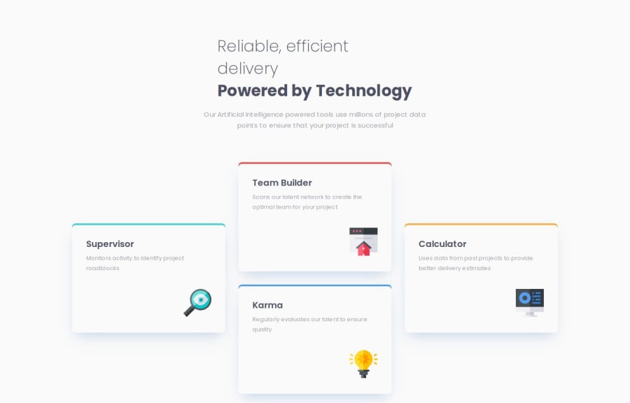
Design comparison
SolutionDesign
Solution retrospective
What are you most proud of, and what would you do differently next time?
I am proud that I found a solution for all the tasks in this project.
What challenges did you encounter, and how did you overcome them?There was a problem finding and adding icons. But found a solution.
What specific areas of your project would you like help with?No help is needed at this time.
Community feedback
Please log in to post a comment
Log in with GitHubJoin our Discord community
Join thousands of Frontend Mentor community members taking the challenges, sharing resources, helping each other, and chatting about all things front-end!
Join our Discord
