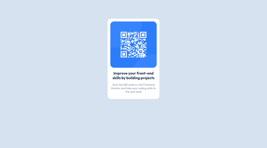


Design comparison

Solution retrospective
I had difficulty with the positioning and the size
Community feedback
- @vanzasetiaPosted over 2 years ago
Hello, Gabriela! 👋
Good effort on this challenge! 👍
I recommend removing the
min-width: 100vhfrom thebodyelement. It makes the site has a horizontal scrollbar on mobile view. Also, it's best to never set anywidthinto thebodyelement. You want to think of thebodyelement like a paper so you should not control thewidthof thebodyelement instead control the size of the elements inside it.For the card, I highly suggest only setting a
max-width(not awidth). By doing this, you prevent the card from becoming too large on a wide screen and letting it shrink on tiny screen sizes.The alternative text for the image shouldn't be hyphenated (like code). It should be human readable. Also, alternative text for images should not contain any words that are related to "image". It's already an image element so there's no need to repeat the information.
That's it! Hope this helps. 😊
Marked as helpful1 - @Sdann26Posted over 2 years ago
Cierto Gabriela pensé que te había hecho todas las observaciones pero al parecer me olvide algunas.
- Si puedes agregale un
box-shadowsi no me equivoco la card lo tiene pero es un poco tenue. - Esto es respecto al reporte que se ha generado. El principal problema es porque el
bodysiempre debe tener unmainque es la etiqueta que engloba todo el contenido principal. Al igual que el body puede tenerfooter,navoasideesta etiqueta tiene su función como te comento solo teniendo en cuenta que si o si debe ir una vez en tu código.
<body>
     <main>
        ...
    </main>
</body>
Agregala y generá un nuevo reporte y debería salirte 0 errores. Ahora si me despido, muchos éxitos Gabriela.
Marked as helpful0@Gabriela-hub-89Posted over 2 years ago@Sdann26 wow super completo, te lo re agradezco, en cuanto pueda hago los cambios
0 - Si puedes agregale un
- @Sdann26Posted over 2 years ago
Hola Gabriela, felicitaciones por acabar tu primer reto de Frontend Mentor!
Respecto al posicionamiento podrías darle al body los siguiente atributos
display: flex;
justify-content: center;
align-items: center;
min-height: 100vh;
Con flex y sus dos primeras propiedades centramos en horizontal y luego en vertical y el min-height nos ayudará a ocupar mínimamente en el eje vertical toda la pantalla.
Por cierto en
style-guide.mdesta la tipografía, dale click al archivo y revisa la tipografía para que te lleve a la página de google fonts para anexar la tipografía a tu proyecto para que quede igual.Marked as helpful0@Gabriela-hub-89Posted over 2 years ago@Sdann26 gracias por las correcciones, y sobre la tipografia está importada al archivo css, y los elementos a y h1 tienen las fuentes aplicadas.
0 - @correlucasPosted about 2 years ago
👾Hello @Gabriela-hub-89, Congratulations on completing this challenge!
Great solution and a great start! From what I saw you’re on the right track. I’ve few suggestions for you that you can consider adding to your code:
Use
<main>instead of<div>to wrap the card container. This way you show that this is the main block of content and also replace the div with a semantic tag.Add
min-height: 100vhto finish the alignment:body { min-height: 100vh; display: flex; justify-content: center; align-items: center; margin: 0; background-color: hsl(212, 45%, 89%); font-family: 'Outfit', sans-serif; overflow-y: hidden; }Use relative units as
remoreminstead ofpxto improve your performance by resizing fonts between different screens and devices. These units are better to make your website more accessible. REM does not just apply to font size, but to all sizes as well.Here's my solution for this challenge if you wants to see how I build it: https://www.frontendmentor.io/solutions/qr-code-component-vanilla-cs-js-darklight-mode-nS2aOYYsJR
✌️ I hope this helps you and happy coding!
0


Please log in to post a comment
Log in with GitHub
Join our Discord community
Join thousands of Frontend Mentor community members taking the challenges, sharing resources, helping each other, and chatting about all things front-end!
Join our Discord