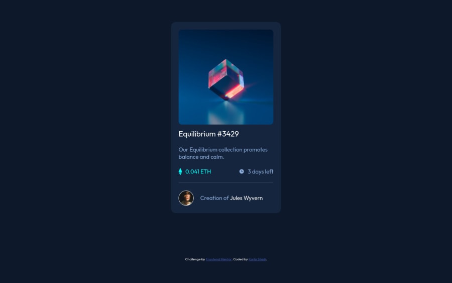
A card component layout with hover states on interactive elements
Design comparison
Solution retrospective
Please tell me how I can improve my HTML skills to be able to use HTML5 in a modern way. I'm wondering should I use the <main> tag.
Is there a best approach to element spacing (e.g. margins vs padding) and which measuring unit shall be used in which case (em, rem, ch, px) and did I use them in a good way?
Is there a better approach to format my CSS without using SCSS, SASS, or similar?
Community feedback
- @anoshaahmedPosted almost 3 years ago
To avoid accessibility issues in the future:
- wrap everything in your body in <main>
- start your headings with h1 and move up by one level each time
- give ur <img> and alt=""
Good job! :)
Marked as helpful0 - @brodiewebdtPosted almost 3 years ago
This looks good. You did a nice job with this. For responsive design, you want to stay away from pixels. I use rems for the text and ems for margin and padding, but using rems is fine too.
Wrap your card div in a Main tag and change the Equilibrium text to an H1. Every page should have an H1 for accessibility reasons. You may have to re-style it to look like the design. Add ALT tags to all your images. They can be empty on this project because the images are for decoration only. Change your attribution div to a Footer and it will clear the accessibility warnings.
Download AXE DevTools and you can clear accessibility warnings while you code. https://www.deque.com/axe/devtools/
Hope this helps.
Marked as helpful0@siladikarlo856Posted almost 3 years ago@brodiewebdt Fixed. Thanks for the tips. I'll check AXE DevTools for sure.
1
Please log in to post a comment
Log in with GitHubJoin our Discord community
Join thousands of Frontend Mentor community members taking the challenges, sharing resources, helping each other, and chatting about all things front-end!
Join our Discord
