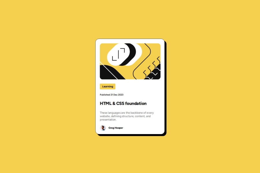
Design comparison
SolutionDesign
Solution retrospective
What are you most proud of, and what would you do differently next time?
Completed this project using the best patterns in css styling. I learn some cool stuffs such as box-shadow and media queries to specify screen layouts for different devices.
What challenges did you encounter, and how did you overcome them?I'm good
What specific areas of your project would you like help with?Good
Community feedback
- @danielmrz-devPosted 8 months ago
Hello @sanyomor-01!
Your solution looks great!
- Some lines of your code are preventing your card from being centered. I've made some changes to fix that, in case you want to:
body {
    /* width: 90rem; */ ❌
    /* height: 60rem; */ ❌
    min-height: 100vh; ✅
    display: flex;
    flex-direction: column;
    justify-content: center;
    align-items: center;
    background: hsl(47, 88%, 63%);
    font-family: "Figtree", 'Courier New', Courier, monospace;
    color: hsl(0, 0%, 7%);
}
I hope it helps!
Other than that, great job!
Marked as helpful1
Please log in to post a comment
Log in with GitHubJoin our Discord community
Join thousands of Frontend Mentor community members taking the challenges, sharing resources, helping each other, and chatting about all things front-end!
Join our Discord
