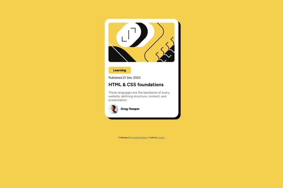


Design comparison

Solution retrospective
The fact that I was able to utilize the browser "dev tools" to make the shadow effect
What challenges did you encounter, and how did you overcome them?I wouldn't say that I had challenges, all through I was able to find a way that solves the problem though it might be unconventional
What specific areas of your project would you like help with?For the text "Learning" what is the best tag to use and also should I specify the width for that element, if so in what unit of measurement?
Community feedback
- P@mkerr-githubPosted 10 days ago
"For the text "Learning" what is the best tag to use and also should I specify the width for that element, if so in what unit of measurement?"
You code links to a different project, the social media links challenge.
basically you can use something like :
<p class="blog-category">Learning</p>and then in the .blog-category class in CSS, use a max-width, and max-height.
The convention for responsive websites is to use rem and sometimes em, instead of pixels for most items, as they are more responsive. pixels can be used for small elements like icons and buttons where you do not want the size to change even on small screens.
What I do, is do everything in pixels first (as the figma designs are in pixels) and then when it looks ok, convert them all to rem.
A rem is 16px, as 16px is the usual default font size on most browsers.
more details here:
If you found anything in this comment helpful, please remember to click the "mark as helpful" button. Thank you!
Keep up the good work, and keep going! 👋
Marked as helpful0

Please log in to post a comment
Log in with GitHub
Join our Discord community
Join thousands of Frontend Mentor community members taking the challenges, sharing resources, helping each other, and chatting about all things front-end!
Join our Discord