

Design comparison

Solution retrospective
Hi :)
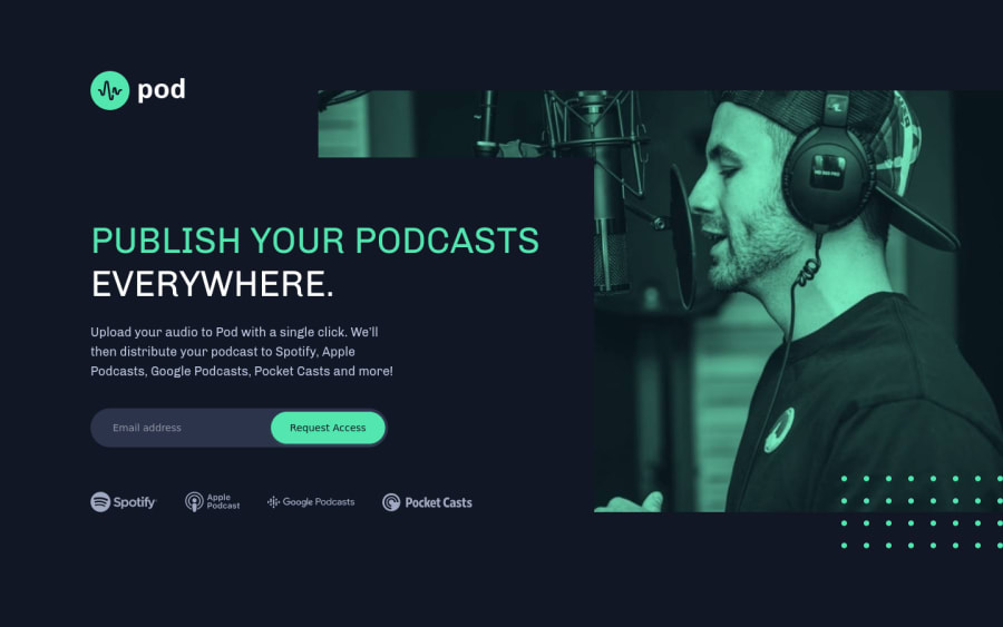
This one was challenging for me concerning the position of the elements on the page. My main goal was to be able to not offer scrolling on desktop and tablet for this project.
I added an extra breakpoint between large screen and tablet to be able to show the host face all the time.
I didn't choose the ease of doing a max-widh to make sure I contained my image. The mockup pasted the image on the right, which I chose to respect regardless of the screen resolution.
I am open to constructive feedbacks, I am you've got one at least, come on ! 🤣
Please log in to post a comment
Log in with GitHubCommunity feedback
No feedback yet. Be the first to give feedback on David Maillard's solution.
Join our Discord community
Join thousands of Frontend Mentor community members taking the challenges, sharing resources, helping each other, and chatting about all things front-end!
Join our Discord