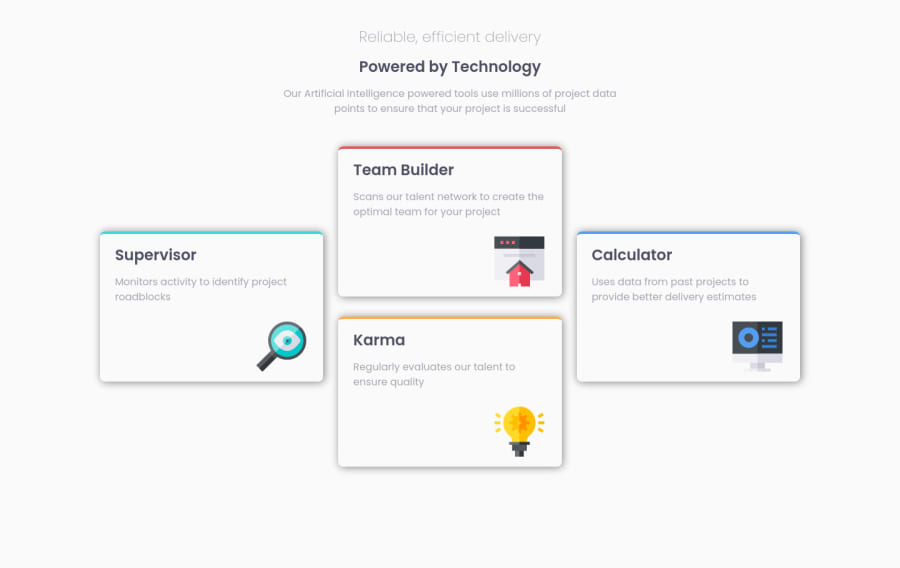
A basic webpage that uses grid to align the card components in columns
Design comparison
Community feedback
- @correlucasPosted over 2 years ago
πΎHello , congratulations for your new solution!
Your solution seems really good, I can see that is fully responsive and the media queries are working fine. I've two advice for you:
1.Use semantic tags to wrap the cards, you can replace the
div
witharticle
. Remember that divs are just block element without meaning. Use divs for really small blocks.2.Work the box-shadow values to reach a smoother shadow reducing the
opacitity
and increasing theblur
. You can create your shadows design in Figma and just drop the code inside the css or use an online tool to create them:CSS BOX-SHADOW GENERATOR:
https://www.cssmatic.com/box-shadow
π I hope this helps you and happy coding!
Marked as helpful1@nandi1514Posted over 2 years ago@correlucas Thankyou. i was really struggling with the box shadows part so thankyou for the tip
1
Please log in to post a comment
Log in with GitHubJoin our Discord community
Join thousands of Frontend Mentor community members taking the challenges, sharing resources, helping each other, and chatting about all things front-end!
Join our Discord