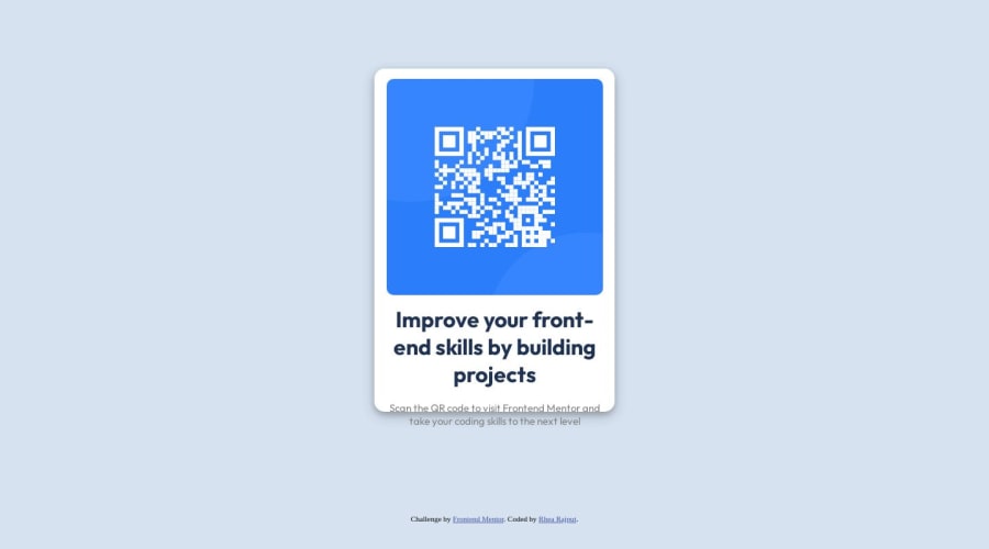
Design comparison
Solution retrospective
I had trouble center-aligning the main div vertically.
Community feedback
- @HassiaiPosted over 1 year ago
Replace<div class="main">with the main tag, <div class="heading"> with <h1>, <div class="subtitle"> with <p> and <div class="attribution"> with the footer tag to make the page accessible. click here for more on web-accessibility and semantic html
There is no need to style .image
For a responsive content,
- Replace the width of the main with max-width value and the height with a padding value for all the sides
max-width: 320px which is 20rem/em padding:16px which is 1rem/em - Give the img a max-width of 100% and a border-radius value, the rest are not needed.
To center .card on the page using flexbox, replace the height in the body with
min-height: 100vh.Give h1 and p the same font-size of 15px which is 0.9375rem, text-align: center,the same margin-left, margin-right and margin-top values. Give p a margin bottom value.
To center .main on the page using flexbox or grid instead of margin,
- USING FLEXBOX: add min-height:100vh; display: flex; align-items: center: justify-content: center; to the body
body{ min-height: 100vh; display: flex; align-items: center; justify-content: center; }- USING GRID: add min-height:100vh; display: grid place-items: center to the body
body{
min-height: 100vh;
display: grid;
place-items: center;
}
Use relative units like rem or em as unit for the padding, margin, width values and preferably rem for the font-size values, instead of using px which is an absolute unit. For more on CSS units Click here and here
Hope am helpful.
Well done for completing this challenge. HAPPY CODING
Marked as helpful1 - Replace the width of the main with max-width value and the height with a padding value for all the sides
- @DebestaPosted over 1 year ago
You have to make 2 different files, one for HTML and one for CSS and if You want the text not to go beyond the edge of the card you can't set a permanent height. Remember if You want to add text You need to use relevant tag (<p>, <a>, <h1>, <h2>, ...). I mean You have to use some of this tags in divs .subtitle and .heading
Marked as helpful1 - @0xabdulkhaliqPosted over 1 year ago
Hello there 👋. Congratulations on successfully completing the challenge! 🎉
- I have other recommendations regarding your code that I believe will be of great interest to you.
CSS 🎨:
- Looks like the component has not been centered properly. So let me explain, How you can easily center the component without using
marginorpadding.
- We don't need to use
marginandpaddingto center the component both horizontally & vertically. Because usingmarginorpaddingwill not dynamical centers our component at all states
- To properly center the component in the page, you should use
FlexboxorGridlayout. You can read more about centering in CSS here 📚.
- For this demonstration we use css
Gridto center the component.
body { min-height: 100vh; display: grid; place-items: center; }- Now remove these styles, after removing you can able to see the changes
.main {
  margin: 100px auto;
}
- Now your component has been properly centered
.
I hope you find this helpful 😄 Above all, the solution you submitted is great !
Happy coding!
Marked as helpful1
Please log in to post a comment
Log in with GitHubJoin our Discord community
Join thousands of Frontend Mentor community members taking the challenges, sharing resources, helping each other, and chatting about all things front-end!
Join our Discord
