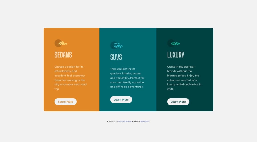
Design comparison
Solution retrospective
Hey guys🖐😊. I tried my first frontend mentor challenge with the 3 column card. Please take a look at it and give me feedback on what you think. What you think i could do to improve, omit or even better practices you think i should take up. I am open to all of them. Thanks in advance.
Community feedback
- @folathecoderPosted over 3 years ago
Hi Mardiya! 😃
Nice attempt to create the sketch. Kudos! Your documentation and commit messages are lit. There are some changes you might wanna make.
I will start listing them under this thread:
- Meta description is important: Try to get in the habit of optimizing a page for SEO. SEO is one of the core skills of a frontend developer.
I recommend you checkout "SEO for developers" on YouTube (like a 20 minute video) and then learn about about open graphs. https://ahrefs.com/blog/open-graph-meta-tags/
- Remove the style tags in your html and it is considered a bad practice to write in-line css.
Writing styles inside your html will take precedence over external CSS, so overriding it will be very difficult.
And you will not be able to maintain your CSS code.
Always use external stylesheets!
- For button design, people usually use the "a" tag instead, because it gives you the flexibility of creating your preferred button from scratch. The "button" tag is a lot of work because you will need to override the existing style before creating yours!
Always use "a" tags for buttons!
- The way you name your CSS classes can be improved. I recommend you learn the BEM naming convention. You can check this on YouTube.
It will help you write nestable CSS. When you start using a preprocessor like scss or sass, you will appreciate it more!
-
Avoid using the break tag "br".... Except when necessary.
-
The 3 cards ought to be placed in the same container and not individually.
This is causing it to distort on smaller screen sizes..
For example, view your work on 1044px screen width!
You will notice that the cards are not properly aligned.LET'S MOVE INTO YOUR STYLESHEET!!😀
- To avoid repetition, always add general settings to the body of your website and not the "main"
Stuffs like font family, background color, etc should be added to the body.
-
You are good with flexbox 😀
-
You can learn more about using variables to write more maintainable css. With this method, you will just need to assign variables to resuseable properties and then insert them when needed.
You won't need to keep repeating yourself.
Below is a good code along video by KEVIN POWELL, it helped me get comfortable with css.
https://youtu.be/bn-DQCifeQQ
Overall, it is a good start! Keep coding! 😎
3@Mardiya07Posted over 3 years ago@folathecoder Thanks alot Fola.🙏 Very much appreciated. I'd look at all the areas you mentioned and improve on them. There is alot of refactoring to be done.
0@folathecoderPosted over 3 years ago@Mardiya07 You are welcome, Mardiya! ....... Happy Coding! 😎👍
1 - @SheGeeksPosted over 3 years ago
Hi Mardiya. Great work on completing this challenge!
One thing I would suggest is increasing the line height of your text using
line-height
.This will add a little more space between the lines to match up with the design.I second most of Fola's suggestions with some additions and differences:
-
You do need a meta description in the head of every webpage, but I wouldn't worry too much about SEO. I would encourage researching website header information and semantic html markup, as a lot of SEO practices are tied to these basic building blocks.
-
For
button
versusa
tag, if the button takes you somewhere else, it's a link and you should use thea
tag. If the button is for submitting information, usebutton
.
Lastly, can vouch for Kevin Powell's videos as well. He's really good with explaining concepts in a simple way to understand.
Again, great work! I think adding all of your CSS to an external stylesheet is one of the biggest improvements you start making to your solution. It'll be good practice, allow you to "see" what's going on with your CSS more easily, and manage it better as you get more feedback and grow in your understanding. Keep going!
2@folathecoderPosted over 3 years ago@SheGeeks Nice input on the button take.... You are correct! I was just giving recommendations specific to this particular project!
Thanks! 👌
1@SheGeeksPosted over 3 years ago@folathecoder All of your recommendations are spot on. Loved reading them. I recently came across an article that dives into the differences between buttons and links, and thought it was such a helpful tip to ensure you always use the right tag.
https://www.smashingmagazine.com/2019/02/buttons-interfaces/
0@Mardiya07Posted over 3 years ago@SheGeeks thanks for the suggestions. I would keep these in mind when making the changes 🙏😇
0 -
Please log in to post a comment
Log in with GitHubJoin our Discord community
Join thousands of Frontend Mentor community members taking the challenges, sharing resources, helping each other, and chatting about all things front-end!
Join our Discord