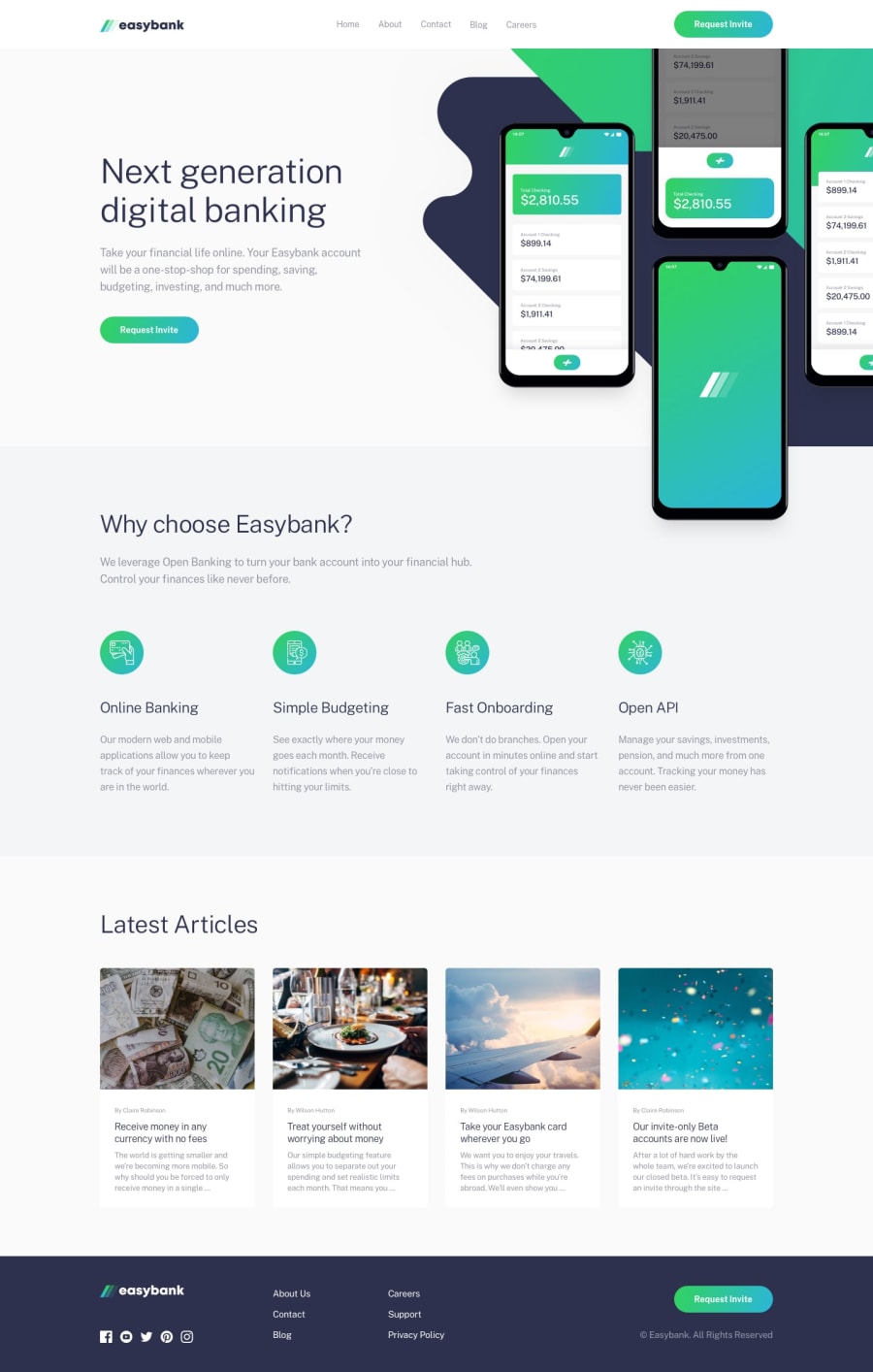
Design comparison
SolutionDesign
Solution retrospective
This went pretty well, on the first half that is, and when I reached to the desktop-breakpoint, it was pretty hard implementing it. Although, I am pretty happy with the outcome in following the 7:1 pattern, since it reduced the LOC in my final output.
However, I did stumble upon some problems, such as the navbar, it felt like the styles that I did to it was pretty hacky, so if you have time and you can look at my code, any suggestions on how to style the navbar in a more elegant manner?
Community feedback
Please log in to post a comment
Log in with GitHubJoin our Discord community
Join thousands of Frontend Mentor community members taking the challenges, sharing resources, helping each other, and chatting about all things front-end!
Join our Discord
