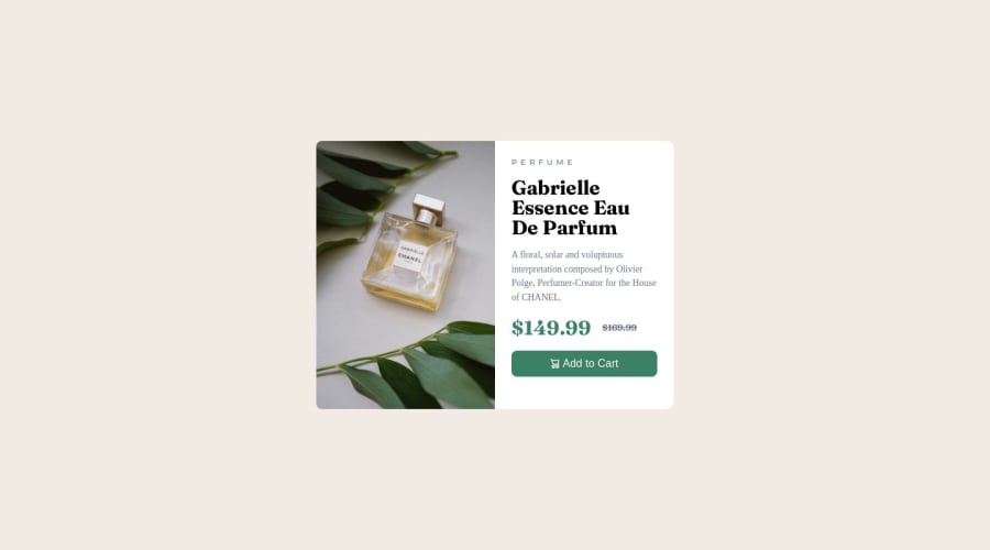
6th Project - Product Preview Card Component


Design comparison

Solution retrospective
Honestly, it was kind of a challenge. I was able to finish the project with help from community members and it helped me learn a lot of new things.
What I have learned:
1. <picture> tag in HTML
- Useful when you use multiple images on the webpage and want to display each on a certain page width breakpoint. One of the attributes inside <souce> tag is "media", this is where you can set the width of the page where you want the certain picture to be shown (like media query, but in HTML).
2. <s> tag in HTML
- if you wrap a text inside, this will cause the whole text will be crossed horizontally with the line. Same as you would apply property text-decoration: line-through in CSS
3. column-gap: CSS property
- equal space between elements in the container apply on container: display: flex together with gap property No need to write extra code writing separately padding/margin on each of the child elements
4. object-fit: cover CSS property
- We didn't have to use it in this project, but when I was trying to tame moving images I discovered this great property, which keeps the aspect ratio the same when the image is resized (It might crop the edges, but the image is not squeezed on the sides when manipulating)
5. Icon image - next to the text
-
HTML:
<button class="button"><span class="cart-icon"></span>Add to Cart</button> -
CSS:
.button{display: flex; align-items; justify-content: center; column-gap: 0.31rem; } .cart-icon{content: url(images/icon-cart.svg); height: 0.87rem;} -
make sure you apply column gap instead of padding to .cart-icon
-
use units of height should be in rem
6. When to use <button> and when <a>
- buttons used only when action is needed
- a tag used when you need to redirect to the other page
7. Only accessible for screen readers, not visible on the page
-
HTML:
<span class="sr-only">Old price</span> <s class="crossed-price"> $169.99</s> -
CSS:
.sr-only { position: absolute; left: -10000px; top: auto; width: 1px; height: 1px; overflow: hidden; }
8. <hgroup> element
- create a more semantically structured heading structure, especially in cases where multiple heading elements are used for a single heading or subheading.
9. Use rem or em units instead of pixels
- especially in HTML
- media queries
- font-size
- line-height
10. Letter spacing property in em unit
- it scales with the text size
11. Line-height property
- use unitless values or % (line-height: 1.5)
12. CSS reset
- Use CSS reset every time, it will help you style easier
13. use class selectors, not element selectors for styling (do not target div, but create a class and then in CSS target the class)
14. max-width: property - Really useful property for responsive container
- instead of defining height, width, and margin on .container in media queries
15. if you want 2 divs inside the container to be equally spread
- use property flex: 0 0 50%
16. flexbox works best on its direct child
- make sure when applying Flexbox, only its direct children work as expected. it might not work properly on grandchildren.
Community feedback
Please log in to post a comment
Log in with GitHub
Join our Discord community
Join thousands of Frontend Mentor community members taking the challenges, sharing resources, helping each other, and chatting about all things front-end!
Join our Discord