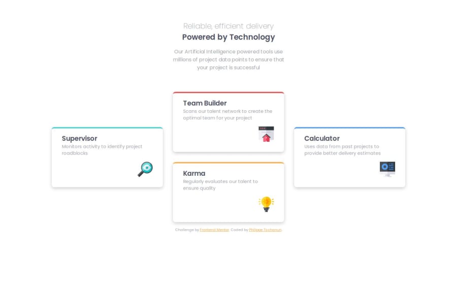
Design comparison
Solution retrospective
The responsivness is quite cool.
What challenges did you encounter, and how did you overcome them?Little things to debog... chatpgt... w3school
What specific areas of your project would you like help with?I still need to check the solution to find you the path to take. I though of using the @media with différents grid-area but then I try to find a solution with the auto-fit approach and then went back to my first intuition... which was good.
Community feedback
- @thomashertogPosted 9 months ago
I feel you have overdone accessibility a bit with this challenge. Imagine you were to look at this with a screenreader. Would you really believe that all the heading levels you used are appropriate? In my opinion this challenge only needs an <h1> to identify the page title and an <h2> to identify the section with the cards. The titles of the cards themselves feel a bit awkward as a heading to me. Same goes for the <h3> in the <hgroup> there is no added value in having that as a heading (to which you can directly navigate). On top of that it feels a bit awkward that you're structuring it like
- <h3>
- <h1>
more down the page 3. a collection of <h2> Heading levels should be thought of as a means to quickly navigate the structure of a website. I'm always comparing it to a table of contents. You wouldn't make a ToC with 1.1.1. above 1. which is above 1.1 up til 1.4, right?
<article> also feels a bit overkill for the different cardsabout the alt text for the icons. alt text should describe the image you're looking at, so i'd replace icon karma with lightbulb icon, though you may argue that these icons are purely decorative in which case i'd leave the alt text empty and add aria-hidden to hide it from screenreaders (as they have little value in a read-out page)
absolutely love how you made the effort of building an in-between layout with just 2 columns.
to make your CSS more maintainable/reusable/readable, you may want to look into CSS custom properties (some people like to call it variables) also, if you're writing with short-hand properties (e.g.
padding: 1rem 2rem 1rem 2rem), notice that there is a shorter version available which has the same effect ->padding: 1rem 2remhope this was insightful however you already did a pretty good job!
Marked as helpful0
Please log in to post a comment
Log in with GitHubJoin our Discord community
Join thousands of Frontend Mentor community members taking the challenges, sharing resources, helping each other, and chatting about all things front-end!
Join our Discord
