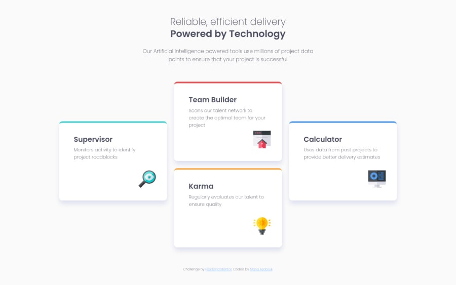
4-card section – HTML/CSS using BEM & flexbox, + keyframes
Design comparison
Solution retrospective
Hi there 👋 Working my way through "newbie" challenges and trying to practice something new when possible! For this challenge, I've used flexbox; and the different positioning of cards in the desktop version got me thinking for some time. I've almost swapped it to the grid display, but went with transform in the end on selected cards with some flexbox tidying-up. As an extra touch, I've practiced @keyframes: I wanted to have each card appear separately and retain the style from the starting point. I think it works nicely, and I have +1 concept in my bag 🎉
Any feedback – let me know, super happy to hear any pointers on how to improve my code 🙌
Community feedback
- @ApplePieGiraffePosted over 3 years ago
Hi there, Maria! 👋
Just wanted to say great job on this challenge! 🙌 Your solution looks good and responds very nicely! 👏 I like the animation that you added to the feature cards and your code looks pretty nice, too! 👍
Of course, keep coding (and happy coding, too)! 😁
1
Please log in to post a comment
Log in with GitHubJoin our Discord community
Join thousands of Frontend Mentor community members taking the challenges, sharing resources, helping each other, and chatting about all things front-end!
Join our Discord
