Not Found
Not Found
Not Found
Not Found
Not Found
Not Found
Not Found
Not Found
Not Found
Not Found
Not Found
Not Found
Not Found
Not Found
Not Found
Not Found
Not Found
Not Found
Not Found
Not Found

Submitted

4 section card using css grid and desktop first.

@YousefSenpai

Desktop design screenshot for the Four card feature section coding challenge

This is a solution for...

  • HTML
  • CSS
1newbie
View challenge

Design comparison


SolutionDesign

Solution retrospective


Any feedback and suggestions to improve the responsiveness are welcomed. I used CSS grid and desktop first then changed to flex column.

Community feedback

@pikapikamart

Posted

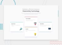
Hey, great work on this one. The layout in desktop is fine and the mobile state is fine as well.

Some suggestions would be:

  1. Adding a bit of padding to the top of the body tag. Right now the layout is pushed to the top, so adding that padding will be really good.

  2. For the responsiveness, since you are using grid, it will be really good if you made a layout like a 2x2. Right now it stays in the desktop layout , going down to mobile state which somehow makes the layout squished if you resize the browser.

Other than those is fine, great usage of html elements. Good job on this one^^

0

@YousefSenpai

Posted

@pikamart Thank you so much for your feedback.

0

Please log in to post a comment

Log in with GitHub
Discord logo

Join our Discord community

Join thousands of Frontend Mentor community members taking the challenges, sharing resources, helping each other, and chatting about all things front-end!

Join our Discord