

Design comparison

Solution retrospective
I improved my previous solution because I didn't use the exact measures of font size and spacing between some html items the first time I did this challenge.
What challenges did you encounter, and how did you overcome them?It was interesting to read my previous code and compare it to how I think and code now.
What specific areas of your project would you like help with?Let me know if you have comments on how I worked with CSS Grid 🤓
Community feedback
- @elroytoscanoPosted over 3 years ago
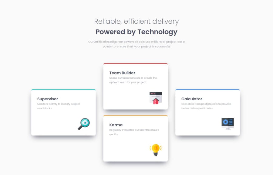
You've done a great job with this. The use of grids and positioning each and every grid item using the grid-row and grid-column attribute is perfect.
One minor thing you may implement, currently, the view changes from column to this 4-card layout at 768px, however, the content of the cards looks as if it could use some more space. In case of a layout that is so big, you could change the view from column to 4 card layout at 1000px or 1024px. This would ensure, that every card would have enough real estate for itself.
Marked as helpful0P@ValeriaMontoyaPosted over 3 years ago@elroytoscano Thank you, I appreciate your comments and suggestions. I'll keep them in mind.
0

Please log in to post a comment
Log in with GitHubJoin our Discord community
Join thousands of Frontend Mentor community members taking the challenges, sharing resources, helping each other, and chatting about all things front-end!
Join our Discord