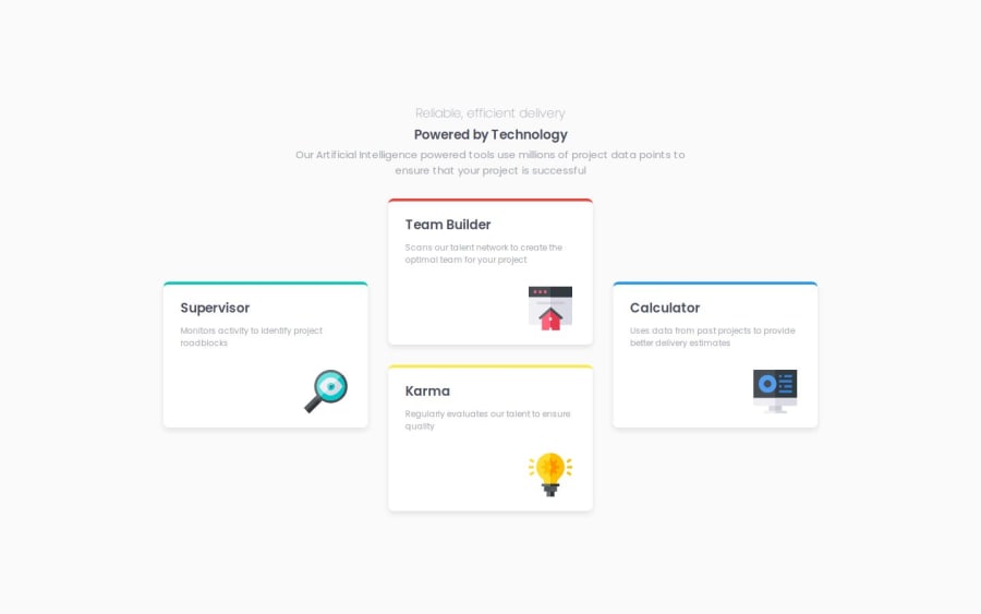
Design comparison
Solution retrospective
Just by seeing the screenshot, I was able to deduce how I was going to write the CSS code. especially the "flex direction: column;" for the middle layout with two different card.
What challenges did you encounter, and how did you overcome them?I had a very stupid problem that took me a while to get. in my media query instead of "(min-width: 1024px)", I wrote "(min-width: 1024)". It took me a while to get it but I was able to solve it and I finished the project soon after
What specific areas of your project would you like help with?I'm good for now.
Community feedback
- @shalriPosted 11 months ago
You may have submitted the dev branch... looking forward to seeing the finished challenge.
0@Daniel999lPosted 11 months ago@shalri I'm sorry but I do not understand what you mean by Dev branch. I've already completed the challenge, the code is on my GitHub and the live site is already hosted.
0 - @RadaidehDanielPosted 11 months ago
Thanks, Daniel, for sharing your design with us.
I want to mention one recommendation, which is using semantic HTML. You use <div> only in your HTML structure.
You can learn more about semantic HTML by reading this article.
I hope this helps.
0
Please log in to post a comment
Log in with GitHubJoin our Discord community
Join thousands of Frontend Mentor community members taking the challenges, sharing resources, helping each other, and chatting about all things front-end!
Join our Discord
