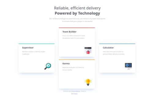
4 Card Feature section using SASS/SCSS & HTML!

Solution retrospective
I took the challenge idea up on its suggestion and used Sass/Scss! It was very useful and was fun to learn. I already can see the potential once I really get a handle on it. I am not sure I would do anything different this time around, as I complete more level 1's I feel more confident, more productive, and more efficient!
What challenges did you encounter, and how did you overcome them?Making the tabs on each of the cards was a challenge figuring out what direction I wanted to go in to make it work. Once I simplified it down the solution became obvious! (position: relative)
What specific areas of your project would you like help with?I would like some best practices on dynamic/responsive sizing for fonts and what is best practice for the transition moment between desktop and mobile styles?
Please log in to post a comment
Log in with GitHubCommunity feedback
No feedback yet. Be the first to give feedback on Benhemin's solution.
Join our Discord community
Join thousands of Frontend Mentor community members taking the challenges, sharing resources, helping each other, and chatting about all things front-end!
Join our Discord