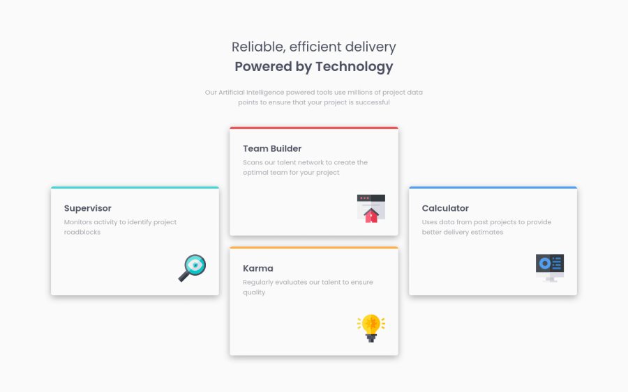
Design comparison
SolutionDesign
Solution retrospective
Again, I would appreciate any comments or feedback on the structure of the HTML and the way the SASS was written. Could anything be done more efficiently or better?
Thanks :)
Community feedback
- @grace-snowPosted almost 3 years ago
Looks good but I'd make a few changes
- the main heading reads as one heading, not two. So if make that one h1 (then all subsequent headings h2s)
- this doesn't need an article element
- the images don't need filled alt. They are decorative images, so alt attribute should be left intentionally blank. You can optionally add aria-hidden or role presentation to ensure the images are always ignored by screenreaders
The scss is pretty good overall. I can suggest some changes
- 1440px is very late to start the desktop layout. Start it as soon as there is room for the layout
- no need for the width on header. Instead why not give a max-width in ch units and margin auto. That's a more common way to limit line length.
I hope this is helpful
Marked as helpful1@DanK1368Posted almost 3 years ago@grace-snow Thanks for the very constructive feedback, this is very helpful.
0
Please log in to post a comment
Log in with GitHubJoin our Discord community
Join thousands of Frontend Mentor community members taking the challenges, sharing resources, helping each other, and chatting about all things front-end!
Join our Discord
