

Design comparison
SolutionDesign

Community feedback
- @Jaimealicante83Posted 3 months ago
Hi,
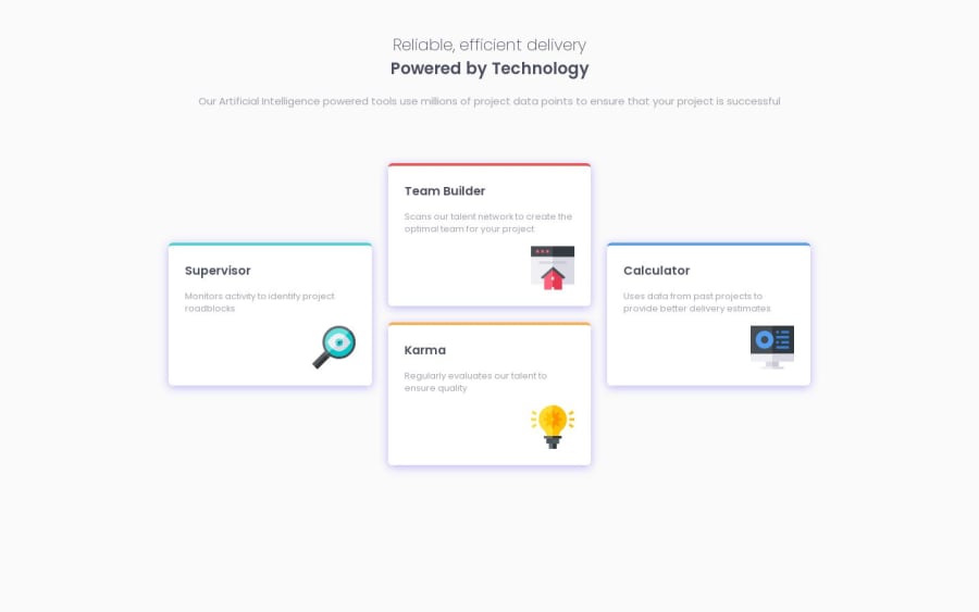
I suggest applying a max-width to the titles container to prevent the paragraph from stretching into a single line. I used a max-width of 540px. Additionally, I recommend double-checking the font sizes, as they appear smaller than in the design.
Good job on the card positioning! However, I would recommend making the cards larger, increasing the gap between them, and softening the shadow to better match the design.
Cheers!
0

Please log in to post a comment
Log in with GitHubJoin our Discord community
Join thousands of Frontend Mentor community members taking the challenges, sharing resources, helping each other, and chatting about all things front-end!
Join our Discord