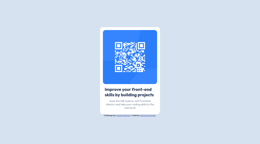
Design comparison
SolutionDesign
Solution retrospective
responsive qr-code challenge.
Community feedback
- @PhoenixDev22Posted over 2 years ago
Hi Santiago Morales,
Congratulation on completing this frontend mentor challenge. Your solution looks great. I have some suggestions regarding your solution:
- You should use
<main>landmark to wrap the card and<footer>for the attribution. HTML5 landmark elements are used to improve navigation experience on your site for users of assistive technology.
- Page should contain
<h1>. In this challenge , as it’s supposed to be a part of a whole page, you may use<h1>withsr-onlyclass hidden visually and present for assistive tech users.
- In my opinion, the image is an important content. The alternate text should indicate where the Qr code navigate the user: like
QR code to frontend mentornot describes the image. The alternate text should not be hyphenated, it should be human readable.
- Adding
rel="noopener"orrel="noreferrer"totarget="_blank"links. When you link to a page on another site using target=”_blank” attribute , you can expose your site to performance and security issues.
Aside, Excellent work! Hopefully this feedback helps.
Marked as helpful1 - You should use
Please log in to post a comment
Log in with GitHubJoin our Discord community
Join thousands of Frontend Mentor community members taking the challenges, sharing resources, helping each other, and chatting about all things front-end!
Join our Discord
