Design comparison
SolutionDesign
Solution retrospective
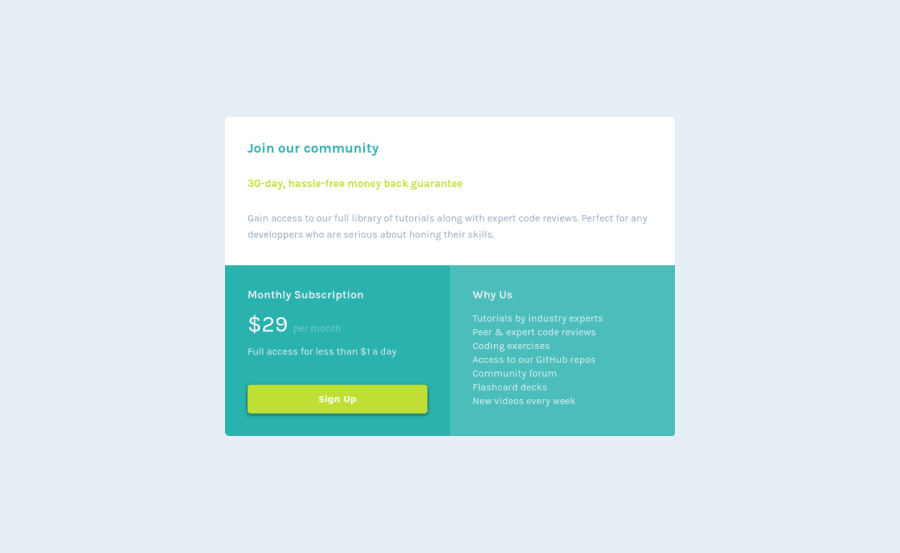
Here is my 3rd challenge! I did not use css grid. Display flex and 100% width did the trick.
Feel free to review!
Happy coding to you!
Community feedback
- @ApplePieGiraffePosted about 4 years ago
Hey, nice job, Florian Pereira! 👏
And congratulations upon completing your third Frontend Mentor challenge! 🎉
I suggest,
- Setting a
max-widthon the component so that it doesn't grow too wide on larger screens. - Adding a box-shadow around the component would be a subtle but nice touch, I think.
Keep coding (and happy coding, too)! 😄
1 - Setting a
Please log in to post a comment
Log in with GitHubJoin our Discord community
Join thousands of Frontend Mentor community members taking the challenges, sharing resources, helping each other, and chatting about all things front-end!
Join our Discord
