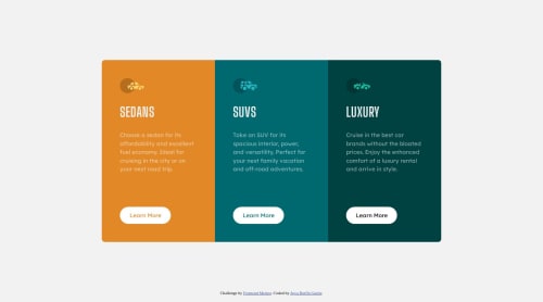
Design comparison
Solution retrospective
This project was far most enjoyable project for me. Hope you like it! Any feedback will be appreciated!
Community feedback
- @coder-96Posted 11 months ago
Merhaba, @aybegu! Mobil çözünürlükte sütun olarak görünmesini deneyebilirsiniz.
The rest looks fine!
1 - @danielmrz-devPosted 11 months ago
Hello again @aybegu! 😊
Your project looks very good!
I have a few suggestions for you to improve it:
-
Try using semantic HTML a bit more. For example, I noticed that you used 2
div
tags for the main container. You could've used only one, and since it's the main content, it could be themain
tag. Usingdivs
is not wrong, but since they don't have semantic value, they are recommended for smaller elements. -
I also noticed that you started the project by it's desktop version and you don't have a mobile version yet. Try the mobile first approach. It makes a lot easier to create the desktop version once the mobile one is finished. The other way around is frequently more difficult.
Other than those little things, you did a great job!
I hope it helps!
0@aybeguPosted 11 months ago@danielmrz-dev Thank you Daniel! Yes I always forget to do the mobile version :D And I will pay attention to the HTML more next time!
1 -
Please log in to post a comment
Log in with GitHubJoin our Discord community
Join thousands of Frontend Mentor community members taking the challenges, sharing resources, helping each other, and chatting about all things front-end!
Join our Discord