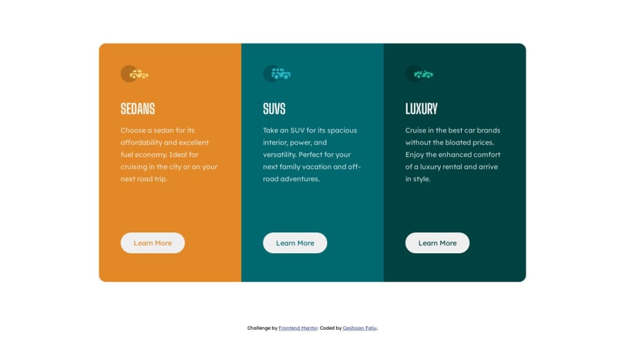
Design comparison
Solution retrospective
I need to practice more Margins and Paddings, any Tips? Thanks!
Community feedback
- @NehalSahu8055Posted about 1 year ago
Hello Coder 👋.
Congratulations on successfully completing the challenge! 🎉
Few suggestions regarding design.
-
Don't use
marginsto center thecontaineras it will not dynamically center the card. -
To properly center the card
-
USING FLEXBOX
parent-container{ min-height: 100vh; display: flex; align-items: center; justify-content: center; }- Use
Semanticsfor the proper design of your code.
<body> <main>... main content goes here ...</main> <footer>...</footer> wrap up `.attribtution(challenge by....)` div inside your footer. </body>- For user interactivity use
button:hover{ cursor:pointer }-
Use
responsive units(rem, em, %)from next project. Explore respective use cases on google. -
Replace
widthwithmax-widthto make your card more responsive.
I hope you find this helpful.
Happy coding😄
Marked as helpful0@CesjhoanFeliuPosted about 1 year ago@NehalSahu8055 Thanks! but i have a question, if i want to center a div with display block, how can i do that without a margin? Have a nice day! :)
0@NehalSahu8055Posted about 1 year ago- Using below code snippet but it's not recommended, always use flex or grid
.centered-element {
  position: absolute;
  top: 50%;
  left: 50%;
  transform: translate(-50%, -50%);
}
Marked as helpful0 -
Please log in to post a comment
Log in with GitHubJoin our Discord community
Join thousands of Frontend Mentor community members taking the challenges, sharing resources, helping each other, and chatting about all things front-end!
Join our Discord
