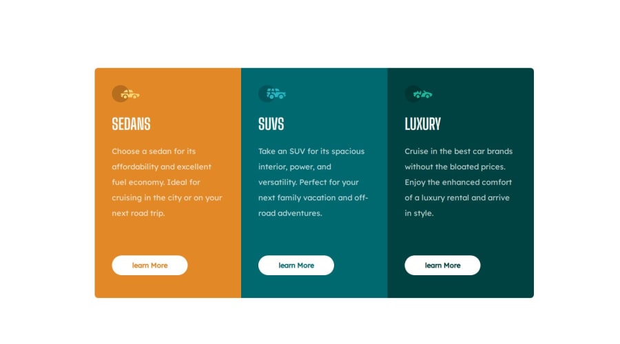
Design comparison
Solution retrospective
Using grid display for the first time, I couldn't organize the columns vertically, so I ended up using flex. On hover, I couldn't eliminate the extra pixel that is applied when the hover is activated. If you have a tip, please comment.
Please log in to post a comment
Log in with GitHubCommunity feedback
- @ivanparraoda
Hi, "The issue of extra size on hover is because you placed an h2 inside the anchor; that h2 is not needed. If you remove it and only place the text you need inside the a tag, the problem is solved."
"Flexbox is especially useful when you need to organize elements in rows or columns. You can use flex-direction: row; for a row layout or flex-direction: column; for a column layout." Create a Flex Container: Apply display: flex; to the container you want to make a flexible container.
The next website is very useful to understand flexbox https://css-tricks.com/snippets/css/a-guide-to-flexbox/
Marked as helpful
Join our Discord community
Join thousands of Frontend Mentor community members taking the challenges, sharing resources, helping each other, and chatting about all things front-end!
Join our Discord
