Design comparison
Community feedback
- @VCaramesPosted about 2 years ago
Hey @DianaVCruz, the tablet layout is pretty smart! I think you are the first to do that.
Some suggestions to improve you code:
-
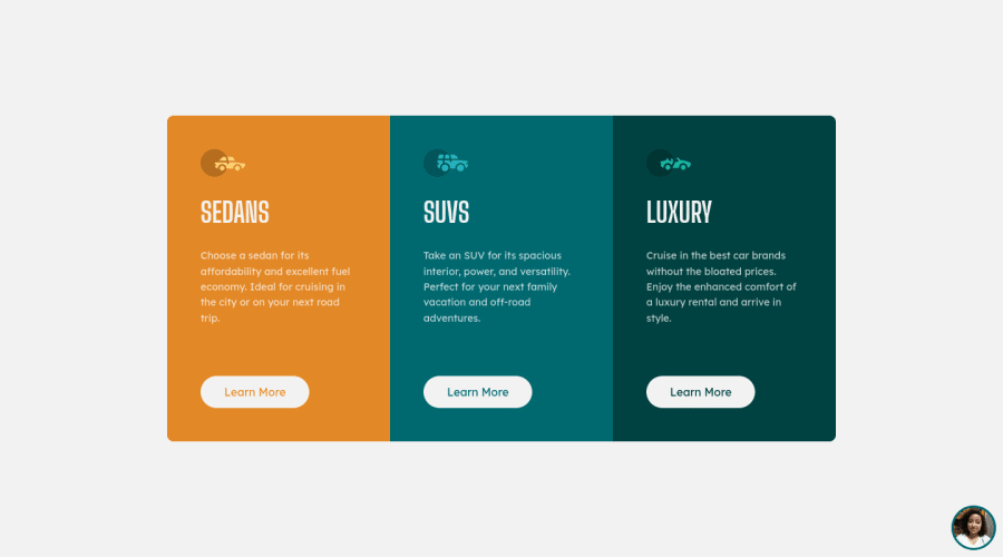
The car images/icons serve no other purpose than to be decorative; They add no value. Their Alt Tag should left blank and have an aria-hidden=“true” to hides it from assistive technology.
-
The headings are being use incorrectly. For this challenge, each heading is equally as important. So best option, is to use <h2> Heading, because it will give each card the same level of importance and it's reusable.
-
Your "buttons" were created with the incorrect element. When the user clicks on the button they should directed to a different part of you site. The Anchor Tag will achieve this.
keep it up! Happy Coding! 👻🎃
Marked as helpful0@dianacruzproPosted about 2 years ago@vcarames Hi!, thanks for your suggestions.😉 Only I have a doubt 🤨, to have good accessibility is it advisable to place h2 elements without an h1 element before?
0@VCaramesPosted about 2 years ago@DianaVCruz
Since this a component for a larger site, it is safe not to use the <h1> Heading.
They way that you set up the headings, the level of importance decreases as you go down the heading hierarchy. So since each heading has the same level of importance, the <h2> Heading would be next viable option (if this was to be added to a large site, the heading level will once again change, to either <h3> or <h4> depending on its importance).
Just saw your portfolio and it is very impressive. The Christmas page is really cool!
Marked as helpful0 -
Please log in to post a comment
Log in with GitHubJoin our Discord community
Join thousands of Frontend Mentor community members taking the challenges, sharing resources, helping each other, and chatting about all things front-end!
Join our Discord
