Not Found
Not Found
Not Found
Not Found
Not Found
Not Found
Not Found
Not Found
Not Found
Not Found
Not Found
Not Found
Not Found
Not Found
Not Found
Not Found
Not Found
Not Found
Not Found
Not Found

Submitted

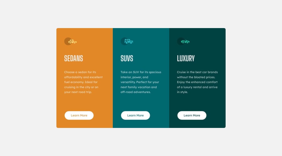
3-Columns Preview Card Component using HTML CSS, CSS GRID AND FLEXBOX

@pmzpro

Desktop design screenshot for the 3-column preview card component coding challenge

This is a solution for...

  • HTML
  • CSS
1newbie
View challenge

Design comparison


SolutionDesign

Solution retrospective


Hello Everyone!! =)

This is my third challenge. I feel like I'm getting better and understanding more but still have a lot to learn.

What I Learned in this challenge

  • Learned more how to make the layout responsive for the user experience depending on their device's screen size.
  • Learned how to add a transparent background in <a> tag (button) for the active effect.

Built with

  • Semantic HTML5 markup
  • CSS custom properties
  • Flexbox
  • CSS Grid

Feel free to say what I could've done better

Community feedback

P

@jairovg

Posted

Hi PMZ, congrats on your solution; here are some comments that might help you to improve it:

Accessibility and semantics

  • This is your heading map:
  Frontend Mentor | 3-column preview card component
    2 Sedans
    2 suvs
    2 luxury

All headings should have a hierarchy and a meaning. You can check this checklist provided by Deque University to learn some best practices related to headings that will help you improve your structure. You may use a .sr-only class so the missing page title may be visually hidden and help to enhance the assistive technologies experience.

  • There is an axe-core ruleset that should be considered. It's related to the document title, in this case, the best practice that may be applied is Put all unique information first. ...company’s name or brand ... should go after the unique content... So the suggested document title should be 3-column preview card component | Frontend Mentor.
  • There is another tag you may use for your .box element instead of a div to improve its semantics.

Styles

  • Do not let the browser have its native focus state to provide a unique experience across devices. Each browser may use this outline differently.
  • It's better to use colour tokens based on their semantic use rather than their colour names. It's better for future refactors or a theme feature.
  • I invite you to modularize your styles instead of having all of them in a single file. You may use CSS naming methodologies that may help you with this.

I hope you find it useful. I'm happy to look at your solution if you make other changes.

1

Please log in to post a comment

Log in with GitHub
Discord logo

Join our Discord community

Join thousands of Frontend Mentor community members taking the challenges, sharing resources, helping each other, and chatting about all things front-end!

Join our Discord