Design comparison
Solution retrospective
Hey coders 👋,
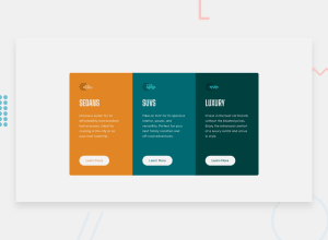
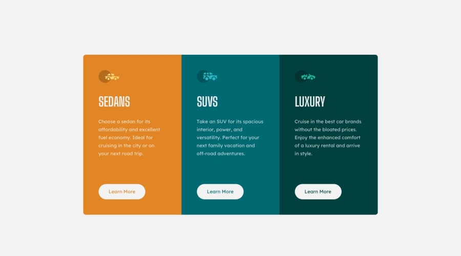
This is my responsive three column card preview, I am really looking forward to get your feedback over my code and how can I improve 👨🏽💻
Happy coding ! 🤓
Community feedback
- @tedikoPosted over 3 years ago
Hello, Mustafa! 👋
Good effort on this challenge! Your solution responds well.Here's my few suggestions:
- Read about semantic. Semantic elements lead to more consistent code, they are easier to read and improve accessibility.
- Try to work on the class names, they are non-intuitive and hard to read in the code. Even tho i know what
card c1is in your code, after some time if I look at the code and i'll see justc1class i wouldn't know what it is. - Since your icons images are decorative your
alttext should be provided empty (alt="") so that they can be ignored by assistive technologies, such as screen readers.
Good luck with that, have fun coding! 💪
0 - @ericsalviPosted over 3 years ago
Hey looks awesome. I am seeing a weird break-point on screens less than 575px in width. Just double check that to make sure you are responsive for most mobile devices.
I would also take a look at paragraph fonts as they seem a bit too bold at that size. I think they should be using the font family from "Lexend Deca'" which will help with the accessibility for readability.
0
Please log in to post a comment
Log in with GitHubJoin our Discord community
Join thousands of Frontend Mentor community members taking the challenges, sharing resources, helping each other, and chatting about all things front-end!
Join our Discord
