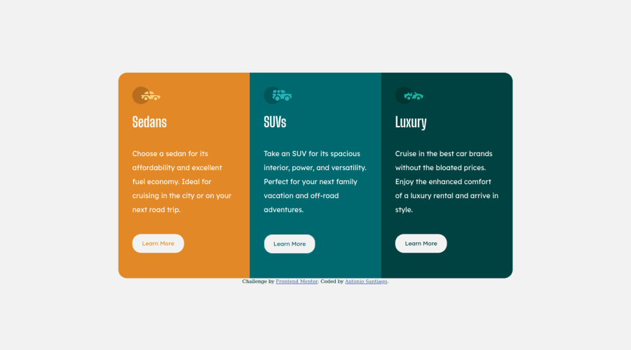
Design comparison
Solution retrospective
5th project, Getting better with dimensions and mobile responsiveness. All feedback welcomed
Community feedback
- @correlucasPosted about 2 years ago
👾Hi Antonio, congrats on completing this challenge!
I saw your solution preview site and I think it's already really good. Here’s some tips for you to improve it:
Your solution seems fine, you did a really good job wrapping the content for these 3 cards. Something you can improve here is to use a
single class
to manage the content that is mostly the same for the 3 cards (paddings, colors, margins and etc) and another class to manage the characteristics that are different (colors and icon), this way you'll have more control over then and if you need to change something you modify only one class.✌️ I hope this helps you and happy coding!
Marked as helpful0@AblueremotePosted about 2 years ago@correlucas i see, were you referring to my div selector? I just realized I could have gave it another class of card on top of the individual class to link them all together (sedans,suvs,etc). I am trying to make it a habit of getting away from using the div element and a actual class.
0 - @hectorestebanmPosted about 2 years ago
Buenas Antonio, buen diseño, tengo unos tics para mejorarlo. Dentro de tu main podrías usar display grid para que se divida en función de la cantidad de columnas que quieras, en este caso de ejemplo 3. Agregar un max-width para que vaya creciendo hasta un máximo que definas. Debes eliminar el padding y ocultar el overflow, ya que sino el border-radius no quedará visible. Debería quedarte así:
main { display: grid; max-width: 800px; grid-template-columns: repeat(3, 1fr); border-radius: 20px; overflow: hidden; }
Agrega en tu body la siguiente línea para que tu card quede centrado tanto vertical como horizontalmente: align-items: center;
Por último, el color de tus botones debe ser igual al color del background de cada columna. Espero te sirvan para mejorar estos tics.
Marked as helpful0@AblueremotePosted about 2 years ago@hectorestebanm Gracias, ¿hay alguna limitación para usar flexbox vs grid? Lo cambié a cuadrícula para principal y móvil y noté su 1 elemento menos y más fácil de manipular. Mi flexbox podría haber ajustado el ancho un poco más.
0 - @SatellitePeacePosted about 2 years ago
Hey Santiago nice work in general but here are a few things you should fix
- to make the cards more responsive on smaller screens, use
body { display: flex; flex-direction: column; } main { display: flex; flex-direction: column; height: fit-content; padding: 0; } } to ensure that the cards look great on a single column you should add margin to the body and justify contents to center like so ```````@media only screen and (max-width: 600px){ body { display: flex; flex-direction: column; justify-content:center; align-items:center; margin: 3rem } } - secondly, your buttons are only readable on hover state you should probably use the hover state as the default state. ```button { border: 1px solid white; background-color: transparent; border-radius: 20px; border-style: none; color: white; font-family: 'Lexend Deca', sans-serif; padding: 1em; width: 50%; margin: 10% 0; } button:hover { border: 1px solid white; background: a colour with good contrast like a darker version of the card colour; color: #fff; } -i hope this helps
Marked as helpful0
Please log in to post a comment
Log in with GitHubJoin our Discord community
Join thousands of Frontend Mentor community members taking the challenges, sharing resources, helping each other, and chatting about all things front-end!
Join our Discord