Not Found
Not Found
Not Found
Not Found
Not Found
Not Found
Not Found
Not Found
Not Found
Not Found
Not Found
Not Found
Not Found
Not Found
Not Found
Not Found
Not Found
Not Found
Not Found
Not Found

Submitted

3-column-preview-card-component-v2.0

P
Alper 1,010

@adonmez04

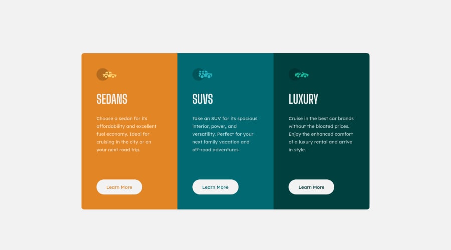
Desktop design screenshot for the 3-column preview card component coding challenge

This is a solution for...

  • HTML
  • CSS
1newbie
View challenge

Design comparison


SolutionDesign

Solution retrospective


Hi, everyone.

This is my second solution to the project (the mobile first again). I got a huge feedback from Grace Snow and fixed some bugs according to them. I tried to solve some problems with responsive design. I guess this solution is a progress. I know there are lots of issues still here. I hope I can find and fix them. Thanks...

Any comments, critique, advice is greatly appreciated. For those of you reading this, have a nice day!

Community feedback

P
Dave Quah 650

@Milleus

Posted

👋 Hello!

I think one thing that could be improved on is the heading levels. I'd view "Sedans", "SUVs" and "Luxury" as the same heading, but I also understand that we do not want multiple <h1>.

I think it would be better to declare a <h1> but set it for screen readers only (meaning not visible but screen reader would still pick it up), and keep "Sedans" as a <h2> with "SUVs" and "Luxury". E.g.

// CSS
.sr-only {
  position: absolute;
  top: auto;
  height: 1px;
  width: 1px;
  overflow: hidden;
  clip: rect(1px, 1px, 1px, 1px);
  white-space: nowrap;
}

// HTML
<h1 class="sr-only">Learn more about our cars</h1>
...
<h2>Sedans</h2>
<h2>SUVs</h2>
<h2>Luxury</h2>

Another suggestion is that for images that are decorative, the alt should be alt="" instead of alt="#", or alternatively you could also set aria-hidden="true" to hide it from screen readers.

Some useful resources:

I hope this helps and happy coding~

Marked as helpful

1

P
Alper 1,010

@adonmez04

Posted

Hi, @Milleus.

The page hierarchy was a big problem at my first solution. I checked some solutions and saw this code on some projects but I couldn't understand it so I didn't add the code.

In my second solution, I passed this problem, had limited energy so chose the easiest way and simple solution, wanted to focus on other problems but knew it wasn't a solution. Based on your feedback, I changed my code. It looks more professional right now. I'm also new to decorative images and I need to read your resources.

Thanks for your helpful comments.

0

Please log in to post a comment

Log in with GitHub
Discord logo

Join our Discord community

Join thousands of Frontend Mentor community members taking the challenges, sharing resources, helping each other, and chatting about all things front-end!

Join our Discord