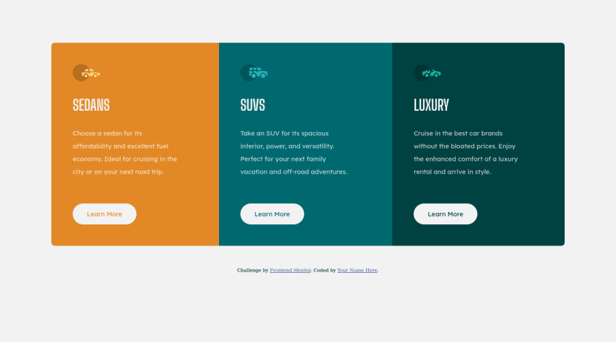
Design comparison
SolutionDesign
Solution retrospective
I open for all feedback! thanks in advance
Community feedback
- @MelvinAguilarPosted about 2 years ago
Hi @Lorgensky 👋, good job completing this challenge,! 🎉
I have some suggestions you might consider to improve your code:
- The
<h1>element is the main heading on a web page. There should only be one<h1>tag per page. The HTML Section Heading elements (Reference). This case requires thatSUVS,SEDANS, andLUXURYbe<h2>elements.
- The
Learn Moreelements should beanchortags and not buttons because they redirect to another part of the page.
- Not all images should have alt text. Car icons are for decoration purposes only, so they can be hidden from screen-readers by adding
aria-hidden="true"and leaving its alt attribute empty:
<img src="./images/icon-sedans.svg" alt aria-hidden="true">
<img src="./images/icon-suvs.svg" alt aria-hidden="true" >
<img src="./images/icon-luxury.svg" alt aria-hidden="true" >
I hope those tips will help you! 👍
Good job, and happy coding! 😁
0 - The
Please log in to post a comment
Log in with GitHubJoin our Discord community
Join thousands of Frontend Mentor community members taking the challenges, sharing resources, helping each other, and chatting about all things front-end!
Join our Discord
